The Mysteries of Blue: From Divine Pigments to Corporate Branding
Blue, more than any other colour in the visible spectrum, carries a remarkably flexible and varied set of meanings. It can be. Sacred and solemn, cool, and critical, universal and corporate. Trace it through history and you will discover a tale of trade routes, chemical experiments, imperial luxury, industrial technology, devotional decadence, and date-centred branding. Blue has never been just a colour; it is a system of symbols that cultures have written and rewritten over thousands of years.
Beginnings in Fire and Glass
The oldest chapter in the history of blue is also the most historically intriguing. Ancient craftsmen located in the Nile Valley were the first to “create” blue by heating silica, copper compounds, lime, and alkaline materials to create a copper-silicate substance called “cuprorivaite” also knows as “Egyptian Blue”. (Warr, 2021) During a time where pigments were rare discoveries, the artificially made blue pigment gained fame in wall paintings, sculptural designs, and various inlays through Egypt, and later spreading to the boarder Mediterranean region. Museum archives and scholarship research place Egyptian Blue as the central blue in Pharaonic art pieces, famous not only for aesthetic but also its impact in science. (Johnson-McDaniel & Salguero, 2014)

Figure 1: Pigment, small triangular lump or cake of Egyptian blue, much granulated.
Image Credit: © The Trustees of the British Museum. Shared under a Creative Commons Attribution-NonCommercial-ShareAlike 4.0 International (CC BY-NC-SA 4.0) licence.
Egyptian Blue’s tale did not end with antiquity though. In the late 1900s and early 2000s, scientists rediscovered an integral property of the pigment; the pigment emitted an intense glow in the near-infrared range when it was subjected to visible light. This luminescent property became a superior tool for navigating the traces of the colour on artefacts and paintings that appeared “uncoloured” to the naked eye. Even in current research, Egyptian blue has uses in bio-imaging and other photonic technologies. Blue is evidently consistently innovating. (Miliani, 2009) (Seymour, et al., 2020)
Lapis Lazuli, Ultramarine and Devotion
While Egyptian blue was the scientific triumph of history, ultramarine blue became to the indulgence of theology and religious iconography. Created by grinding Lapis Lazuli, it was imported from the mines of Badakhshan in modern-day Afghanistan and taken across Europe through costly trade routes making it the most expensive of blues. The standing of ultramarine in the hierarchy of workshop materials, that were paid for by patrons, denoted it a symbol of both piety and wealth, reserved for one solitary subject – The Virgin Mary, transforming it into a declaration of heaven and purity.
Early European paintings of the Virgin Mary depicted her in the radiant blue, showing not only her spiritual importance but also showcasing the largesse of the patron. Archival records and gallery notes show patrons willing to pay more for the use of Ultramarine blue over cheaper alternatives like azurite and smalt. The Virgin Mary’s cloak thus becomes an account diary – divine proximity bought via the costliest pigment available on the palette.
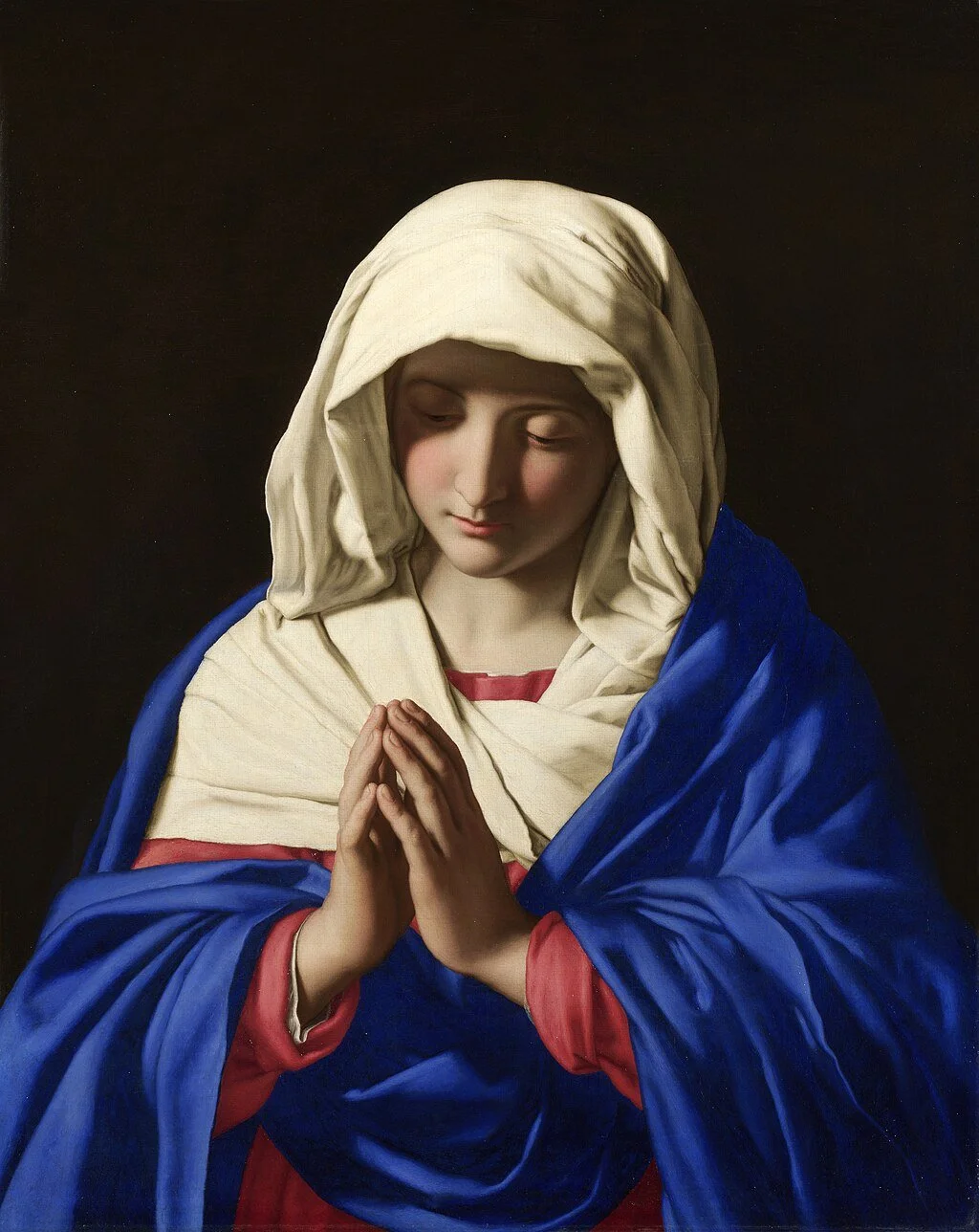
Figure 2: The Virgin in Prayer, Sassoferrato, 1640-50. © The National Gallery
Image Credit: By Giovanni Battista Salvi da Sassoferrato - Web Gallery of Art: Image Info about artwork, Public Domain, https://commons.wikimedia.org/w/index.php?curid=1432637
Taking Sassoferrato’s, “The Virgin in Prayer” located in the National Gallery London; the deep and intense drapery entirely saturated in blue – that was confirmed as ultramarine blue by the museum’s researchers – delivers the role of both theological radiance and optical engagement, capturing the attention to the figure depicted; the rarity of the mineral altered to religious prestige.

Figure 3: Hexagonal porcelain bottle with underglaze blue decoration. Each face is painted with a cartouche enclosing a fabulous beast - horse, lion, leopard, qilin with spots, qilin with scales, and another qilin with spots. The base carries a four-character inscription.
Image Credit: © The Trustees of the British Museum. Shared under a Creative Commons Attribution-NonCommercial-ShareAlike 4.0 International (CC BY-NC-SA 4.0) licence.

Figure 4: Basin (footed). Flower design. Made of blue, turquoise, white painted and glazed ceramic, pottery.
Image Credit: © The Trustees of the British Museum. Shared under a Creative Commons Attribution-NonCommercial-ShareAlike 4.0 International (CC BY-NC-SA 4.0) licence.
The Porcelain Blue Through Cobalt
Ultramarine shaped European decadence in paintings, cobalt blue pioneered the world of ceramics. In Ming and Yuan dynasty China, cobalt oxide was used to under glaze porcelain to make the famous “blue and white” style. The cobalt used in early Chinese ceramics came from Persia, creating links between mines from the Islamic world and kilns in China and establishing a living history of trade. (Menzies, 2009) (Figure 3)
These porcelain objects were extremely valuable items that were exported from China, becoming an inspiration to the Iznik workshops during the Ottoman empire; cobalt and turquoise became a key element in the decorations of mosque tiles and court décor. Iznik blue tiles made from cobalt showed a blue that transformed everyday areas into gardens of paradise in Islamic art. (Figure 4) In the 17th century, the blue and white aesthetic made its way into European homes and became a staple in middle-class interior décor.
Cobalt blue became a connecting thread that stretched across centuries and borders. Porcelain blue became a global phenomenon, not just a simple decorative element.
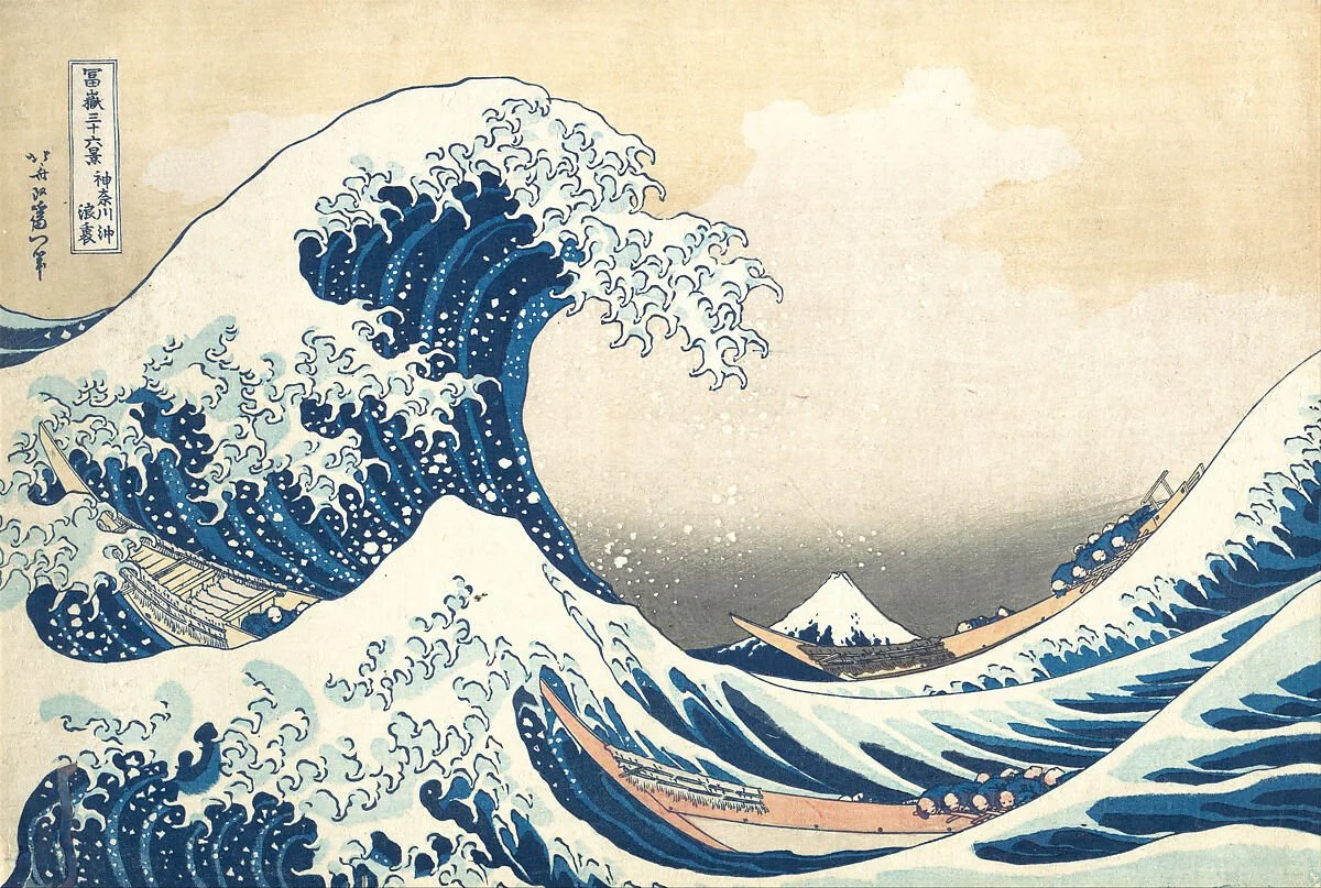
Figure 5: Woodblock print, 'In the Hollow of a Wave off the Coast at Kanagawa' from the series 'Thirty-six Views of Mount Fuji' by Katsushika Hokusai, Japan, later printing / reproduction of an original first published circa 1831.
Image Credit: © The Metropolitan Museum of Art
Prussian Blue and Cyanotype
In the steps of the Egyptian Blue’s conception, Prussian blue was synthesized accidentally by a Berlin colour makers in 1704 creating the first modern synthetically made pigment. It was a revolutionary pigment in Asia and Europe due to its intense pigmentation and the fact that it was affordable.
The most vivid use of Prussian Blue is seen in the work of Katsushika Hokusai in his series, “Thirty-six views of Mount Fuji” which also include the famous “Under the Wave off Kanagawa”; allowing for a depth of chromatic use that was impossible before the Prussian Blue. (Figure 5) The Metropolitan Museum’s conservators noted that in ukiyo-e prints, woodblock prints made popular during the Edo period, Prussian blue became “the engine of a blue revolution”. (Davies, 2017)
Prussian Blue also became the power source for cyanotypes, a process for photographs that was developed by Sir John Herschel in 1842.Originally used for scientific illustrations and blueprints for architecture, cyanotypes are still a prominent photographic method that combines industrial approach to colour chemistry. (Ware, 2014)
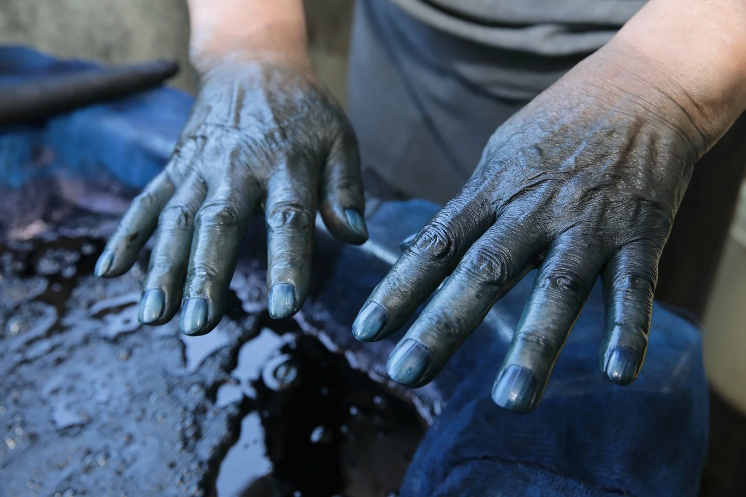
Figure 6: Indigo Dying in Hokkaido
Image Credit: Photograph by Ito Rumiko via KAI
Modern Shades in Indigo and Denim
Moving from painting and prints, fabric dyers used indigo, a natural plant-based dye that allowed for deep pigmentation in shorter times. “Japan Blue” were a collection of shades that were developed from a process called “aziome” or indigo dyeing, that became an emblem of culture. Indigo also had qualities that made it the preferred garment for labourers and samurai alike due to its durability its ability to repel insects. (Figure 6)
In the European world, indigo entered via the colonial trade routes that expanded textile and fabric industries through the slave trade set up in America. Levi Strauss’s blue denim jeans became an icon by the 19th century via dyed denim fabric - making garments for work a global fashion trend and immortalizing Levi and denim blue.
The other most prominent indigo variety to make an appearance was navy blue. Navy Blue was made a part of the uniforms of the British Royal Navy in 1784 following which the navy blue became a colour associated with authority, discipline, and further one, enforcers of the law. It eventually made its way into formal, professional attire like blazers, school jackets, and eventually becoming the icon of corporate attire.

Figure 7: IKB 79', Yves Klein, 1959 via Pinterest
In the 20th century, blue transformed from a colour to an experience through the work of Yves Klein. He created a pigment called International Klein Blue which was a matte textured ultramarine blue that was suspended in synthetic resin. Klein remarked about his blue, “Blue has no dimensions, it is beyond dimensions” stating that blue represented an infinite void, representing pure abstract vastness found in the sky and sea. (Stitch, 1999)
Klein also registered his Klein Blue in France under a Soleau Envelope instead of a patent, to place emphasis on his conceptual development and not limit the use of the colour itself. International Klein Blue changed the art world and use of pigments from material components to transcendent elements of emotion and abstraction beyond the canvas. Klein’s blue suspended blue as a monochrome space to be immersed in, not a divine representation in the Virginal Lapis, nor a flower motif in the Cobalt porcelain, but an entity worthy of its own identity; a phenomenon that would be captured in its adoption by the corporate world of brands.
Figure 8: IBM Partner World
Image Credit: Wikimedia Commons, Public Domain
In the contemporary world, markets everywhere have co-opted blue as a defining or rather an essential hue in their brands palettes. Blue logos can be seen in every industry – banking, travel, food, entertainment. Keeping aside the practical reason for using blue, which is its consistency on screens across platforms, it’s been evidenced that there are underlying reasons for the markets’ use of blue. Laurence Labrecque and George Milne conducted a study that mapped different hues and shades onto the perceptions of various “brand personalities” and the findings showed that blue was associated with feelings of competence and reliability, whereas red shades spoke of excitement. (Labrecque & Milne, 2011). In a public survey conducted by YouGov in 2015, the most popular colour globally was blue.
Think of the IBM logo, designed in 1972 by Paul Rand as that helped solidify the company’s reputation as trustworthy. The blue, called “IBM Blue” in the company’s archive did not make the company trustworthy, but rather it communicated their intentioned look to the public in a way that universally understood across the globe.
This isn’t something that is surprising; Blue becomes cold, calculating, and bureaucratic to some brands, but reliable, classy and spiritual to others; however, the underlying claim is of the hue being inherently and unusually flexible. Blue can cross continents, adapt to local cultures without becoming illegitimate, and can portray a variety of moods in its essence – dependable, sombre, electric, or powerful.
Blue Today
In the current, contemporary world, blue is still a colour of innovation, tradition, and experience, taking years of history and transforming it to modern contexts. In the virtual world, brand apps, social media platforms, corporate logos, and even operating systems make sue of the evergreen (pun unintended) blue to convey a reassurance of calm and trust.
Even artists still employ various hues of blue to transform space and public perception; Olafur Eliasson’s “Room for one colour” is a great example of how deep blues among other colours to negotiate space. Think also of Yayoi Kusama’s polka dots that sometimes feature blue, lending to an immersive environment: Kusama’s use of blue calls for repetition and a sense of vastness in conjunction with her dialogue of broader themes.
Anish Kapoor’s Vantablack or the world’s blackest black seems to be a direct opposition in conceptual origin to Klein’s International Klein Blue; both of these shades are essential conversations on how the boundaries of colour, perception, material, composition, and pigment can be pushed and adopted through the centuries.
Finally, Pantone named the “Classic Blue” it’s 2020 “Colour of the Year”, explain it to be a calm during difficult times, cementing it as a consistent shade in the emotional sphere. Perhaps it is no surprise humans live and thrive on “The Blue Planet”, enshrining our bond with this flexible and captivating shade, not just in business, art, but also in climate activism and protests.
So the next time you come across a blue logo on your screen, think of Egyptian Blue in Tomb paintings, Sassoferrato’s Virgin Mary, Ming Dynasty porcelains, Iznik tiles, and Yves Klein, and know that the visual cues may be modern and new, but the language of blue remains an old and ancient one.
Sources
Davies, H. (2017, July 20). Friday essay: from the Great Wave to Starry Night, how a blue pigment changed the world. The Conversation.
Johnson-McDaniel, D., & Salguero, T. T. (2014). Exfoliation of Egyptian Blue and Han Blue, Two Alkali Earth Copper Silicate-based Pigments. Journal of Visualized Experiments.
Labrecque, L., & Milne, G. (2011, January 28). Exciting red and competent blue: the importance of color in marketing. Journal of the Academy of Marketing Science, 40, 711-727.
Menzies, J. (2009). Blue and White: Chinese Porcelain and Its Impact on the Western World. Sydney: Art Gallery of New South Wales.
Miliani, C. (2009). The exceptional near-infrared luminescence properties of cuprorivaite (Egyptian blue). Chemical Communications.
National Gallery London. (n.d.). Titian’s Painting Technique from 1540. National Gallery Technical Bulletin, 36, pp. https://www.nationalgallery.org.uk/media/24101/vol36- notesandbibliography.pdf?utm_source=chatgpt.com.
Seymour, L. M., Nicola, M., Kessler, M. I., Yost, C. L., Bazzacco, A., Marello, A., . . . Masic, A. (2020). On the production of ancient Egyptian blue: Multi-modal characterization and micron-scale luminescence mapping . PLOS.
Stitch, S. (1999). Yves Klein. Stuttgart: Hatje Cantz.
The National Gallery. (2014). Making Colour. Retrieved from The National Gallery - Past Exhibitions:
https://www.nationalgallery.org.uk/exhibitions/past/making-colour/journey-through-colour Ware, M. (2014). Cyanomicon: The History, Science and Art of Cyanotype: photographic printing in
Prussian blue. Buxton: Science Museum.
Warr, L. N. (2021). IMA–CNMNC approved mineral symbols. Mineralogical Magazine, 85(3), 291-320.
Images
https://www.britishmuseum.org/collection/object/Y_EA5563
https://commons.wikimedia.org/wiki/File:SASSOFERRATO_-_Virgen_rezando_(National_Gallery,_Londres,_1640-50).jpg
https://www.britishmuseum.org/collection/object/A_Franks-133
https://www.britishmuseum.org/collection/object/W_G-66
https://www.metmuseum.org/art/collection/search/45434
https://kai-hokkaido.com/archives/en/feature_vol52_indigo/
https://commons.wikimedia.org/wiki/File:IBM_logo_in.jpg