What inspired you to write this book, and how did your own experience as an artist shape the content?
It might seem obvious, but I love colour. It didn’t start out that way though, it started out as idle curiosity and the odd question about how colours mix for my work as an artist, but it has, over the years, drawn me deeper and deeper by degrees into this beautiful subject. Colour occupies the space between the positive and the negative, light and darkness. You don’t see colour unless something is missing from white light. Colour could described as incomplete daylight, and it’s that sort of weirdness and wonder keeps me fascinated by it. So working out how it does what it does in terms of colour mixing in both paint and light is now something that I work on everyday.
How did that turn into a book? To be honest, there just didn’t seem to be many, if any, books out there written for artists on mixing colour from both a practical and theoretical point of view, and a lot of friends were saying ‘you should write a book on colour theory’, or perhaps jokingly, ‘when’s the book coming out’ and so I started to wonder if maybe I could write one.
As a professional artist I’d like to think I had a lot of experience of mixing colour, but writing a book meant taking that knowledge and experience to a whole new, often stressful, level! I think being an artist has certainly helped in being able to consider colour theory from a practical perspective and make decisions accordingly. For instance, initially I was going to use computer generated diagrams, but thankfully my son Joe convinced me to do them by hand, so I could show readers what the results would look like in real life, and what to expect if they tried to copy them themselves. So being an artist has hopefully helped me present, what can be confusing subject, from a creative perspective and I hope that’s made the subject more accessible.
How do you decide which visual elements or diagrams are necessary to explain a concept effectively?
Well I’m about as right brained as I could be, a physio even noticed once that my whole body had a right sided bias! In fact I often joke that I’m so right brained that it’s a miracle I don’t walk in circles! I am consequently a very visual learner, so it’s difficult to say which comes first, the concept, or the image of the concept that’s describing it in my mind. I think just about every aspect of colour theory I investigate has to involve a diagram or a series of diagrams. For me they’re like working out a maths problem (which I’m awful at by the way), but using colour and diagrams instead of numbers, so the diagram is like a visual answer to a question I’ve been asking about an aspect of colour. I just choose or create the diagram that seems most effectively to answer the visual problem we’re looking at.
In your opinion, what is the most misunderstood aspect of colour theory among artists?
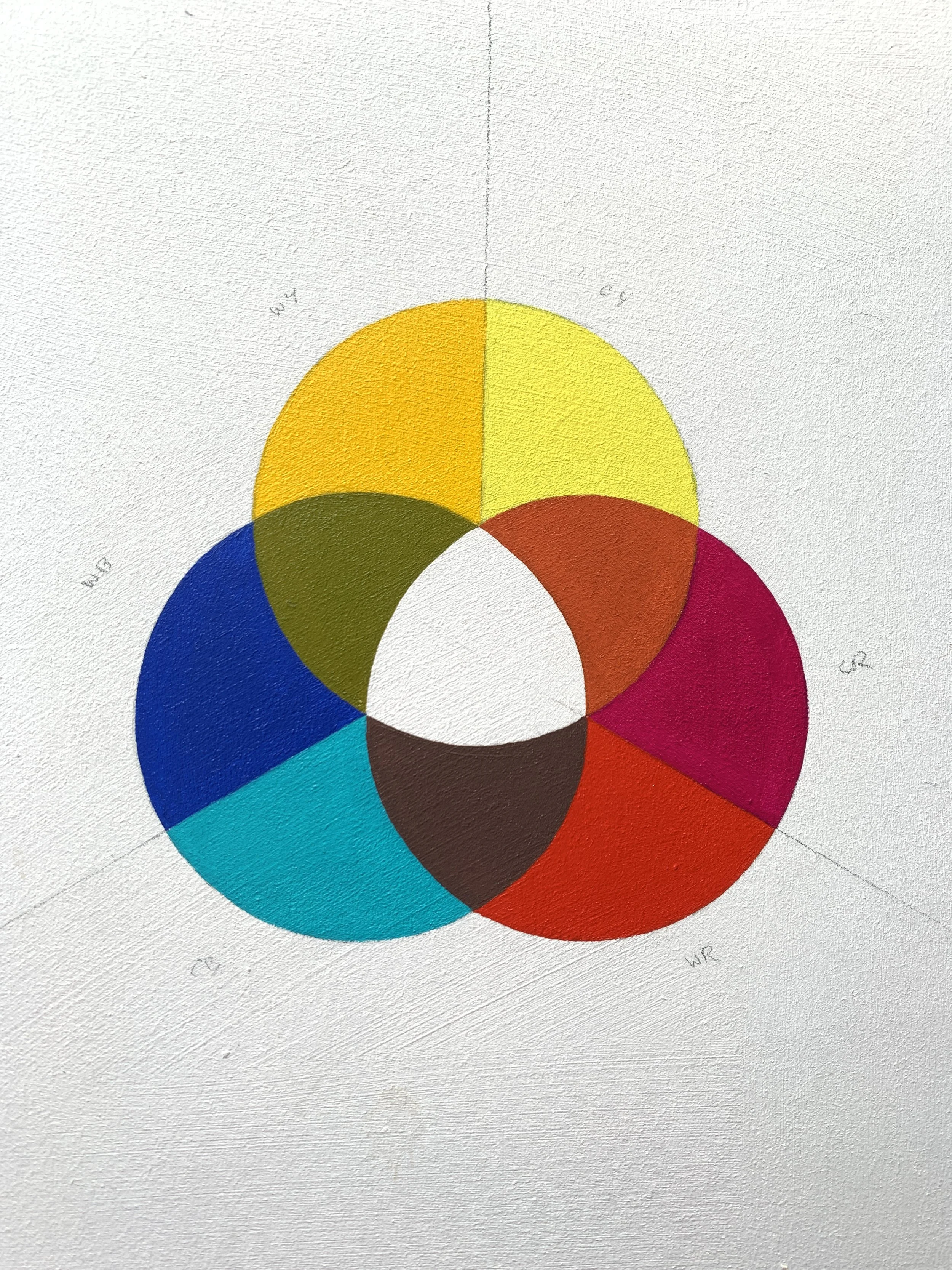
Ooh, that’s a tough question. You could get a thousand different answers to this one from a thousand different artists and scientists, but I’d probably opt for the way primary and secondary colours are taught. There’s a real hang up for many colour theorists on the primary colours. Specifically how many there should be and what hue those (usually three) should be. I mean if I had to pick just three, they would be red, yellow and blue, but I’d never pick just three, as no three hues do a perfect job of replicating the visible spectrum of colours. In fact none of the colours we have available to us as artists ever come alone; they always have the influence of another neighbouring part of the spectrum in there with them. I call that a bias, but the name doesn’t really matter, how it affects colour mixing really does. So if I had to pick an area that’s widely misunderstood, it would be that; the nature of colour bias and how to use it.
What advice would you give to someone who is just beginning to explore colour in their creative work?
Colour is an incredible subject to study. I’ve been pushing it around and observing it everyday, both artistically and semi-scientifically, for quite a while now and I’d say every day it teaches me something new. It can be enjoyed by anyone, from tiny children to quantum physicists, so if you’re new to using colour you’re in for quite a ride!
If you’re just dipping your toe into the world of using colour though, try to keep it simple and read a good book to help you. Colour is both very simple, and also very complicated. There might only be three, or six, primary colours, but juggling the various combinations of those colours in your mind can soon add up, so start with a couple of simple colours and once you’ve squeezed all you think you can out of them, add another colour to those and build your knowledge on that.
Also, trust your intuition as an artist. Most of us, artist or not, have excellent intuitive powers when it comes to colour; after all you’ve been seeing and processing colour since the day you were born. Many professional artists know exactly what to do with colour without necessarily knowing why they’re doing what they’re doing, and most of the time you don’t need to understand the principles underpinning what you’re doing, you can work it out by sight, but having a good understanding of the theory can really help when you get stuck. In those ‘do I trust what I see, or what I know?’ moments, knowing a bit of theory can really help. So above all, play with colour, enjoy it and have fun, but also read a bit of theory and educate yourself about some of those fundamental principles. Most importantly though, learn to enjoy it and love working with it, make it your friend.