Colour and Time
How Artists Employ Colour: Duration, Memory and The Methods of Change
When Colour Refuses to Be Still
Colour is often seen as immediate. We see it at one static time, register it instinctively and respond emotionally before we have time to think. Yet across the history of art, colour has rarely been a stagnant element. It fades, deepens, cracks, oxidises and sometimes disappears altogether. Artists have long understood this instability and rather than resisting it, many have used colour as a way of expressing and capturing the passing of time itself.
From ancient frescoes that slowly transform under natural elements, to Monet’s series, paintings tracking the same motif across hours and seasons, to contemporary artists working with pigments designed to decay, colour has been one of art’s most powerful tools for representing duration, memory and change. (Gage, 1993) This article explores how artists spanning cultures and centuries have used colour not just to describe the world, but to register the passing of time, to hold memories of events and to acknowledge the impermanence of life.
Colour as Process
Art history has often privileged form, composition and iconography, while treating colour as surface or decoration. Yet colour is a fundamental material. Pigments are made from minerals, plants, insects and chemicals. They react to light, humidity, pollution and touch. Unlike line, shape and structure, colour ages.
As art historian John Gage has argued, colour exists at the intersection of physics, perception and culture. It is never fixed and its meanings shift as its material conditions change. This makes colour uniquely suited to expressing time not as narrative sequence, but as physical transformation. (Gage, 1999, 1993) Seen this way, every painting is already a living record of time. Cracked varnish, yellowing whites, faded reds and faded blues are not simply damage; they are evidence of duration. Artists have embraced, resisted, or anticipated these changes in a multitude of ways; turning colour into a temporal medium. (Eastaugh et al., 1974)
Ancient Colour and the Shock of Loss
One of the most striking reminders that colour changes with time comes from artefacts dating back to antiquity. Classical Greek and Roman sculptures were once brightly painted, yet centuries of weathering from the elements of mother nature have erased the most visible pigments. For generations, Western culture romanticised the false idea that ancient art was white, austere and colourless. (Pastoureau, 2010) (Albers, 1971) Contemporary scientific analyses have overturned this assumption. Traces of pigments such as Egyptian blue, cinnabar and ochres in the pores of marble, reveal that ancient sculptures were once vividly coloured.
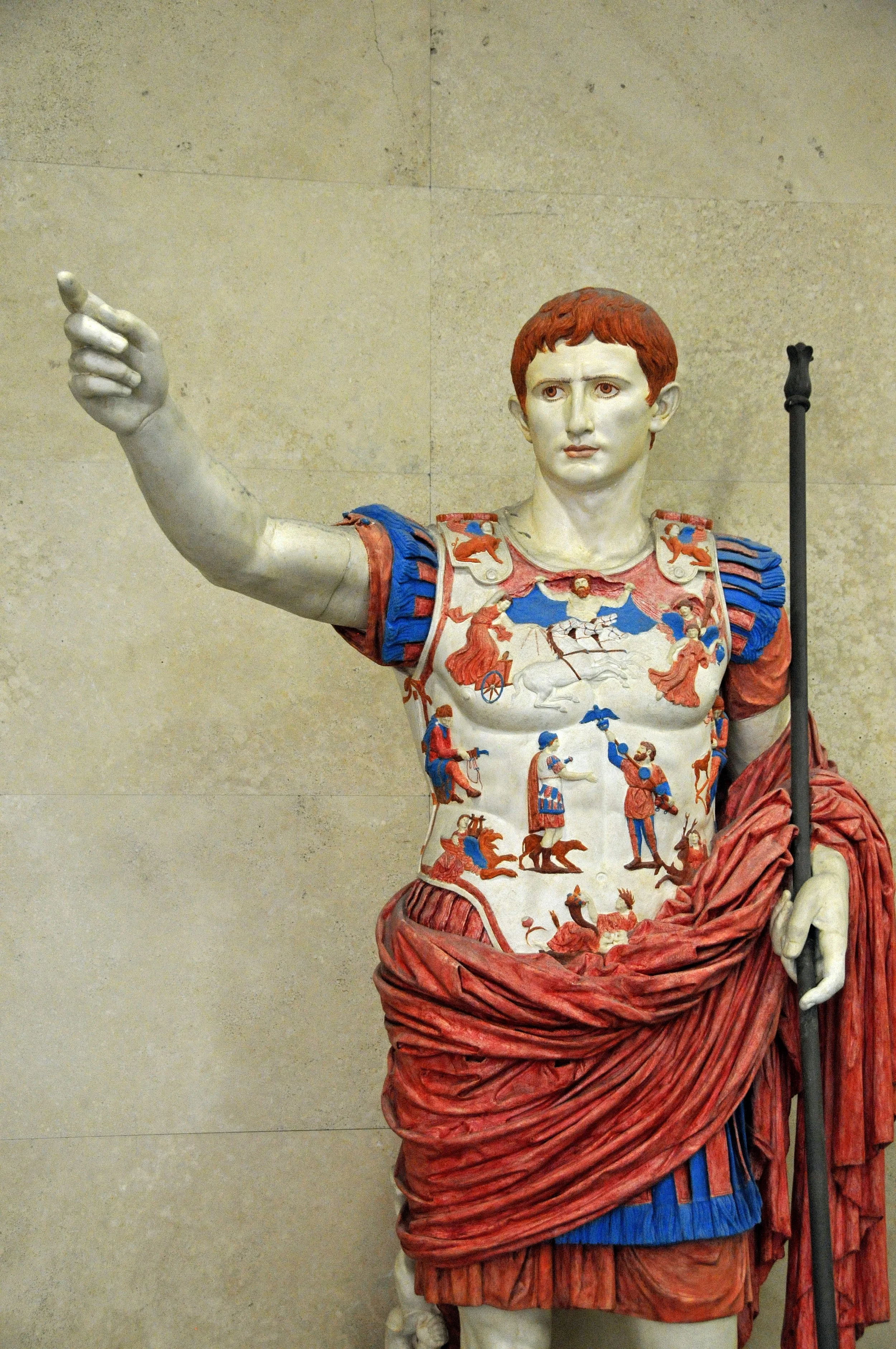
Polychrome reconstruction of the Prima Porta statue of Augustus, 2004. Painted plaster cast made after a prototype by P. Liverani, Vatican Museums, Rome, height 2.2 m.
Image Credit: Wikimedia Commons
These reconstructions force a confrontation with loss. The whiteness we associate with classical art is not timeless purity, but the result of colour’s disappearance. Time stripped these works of their chromatic identities, altering not only their appearance but their cultural meaning. Colour here becomes a marker of historical distance. What we see is not what was made, but what remains.
Fresco, Light and Slow Transformation
In medieval and Renaissance art, colour was often embedded directly into architecture through fresco. Pigments mixed with wet plaster bonded chemically with the wall as it dried. This created luminous surfaces but also made colour vulnerable to environmental conditions. (Bomford, 1990) Fresco painters understood that their colours would change. Blues made from azurite could darken; organic reds could fade. Fresco thus carried an implicit temporality: the painting was never truly finished, only temporarily stable. (Eastaugh et al., 1974) Artists such as Giotto and later Renaissance painters accepted this impermanence. Colour was luminous but fragile, alive to time.
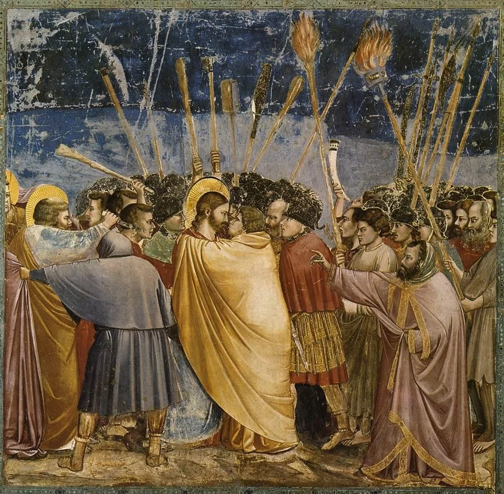
Giotto di Bondone, No. 31 Scenes from the Life of Christ: 15. The Arrest of Christ (Kiss of Judas), 1304-06, fresco, 200 x 185 cm, Cappella Scrovegni (Arena Chapel), Padua
Image Credit: Wikimedia Commons
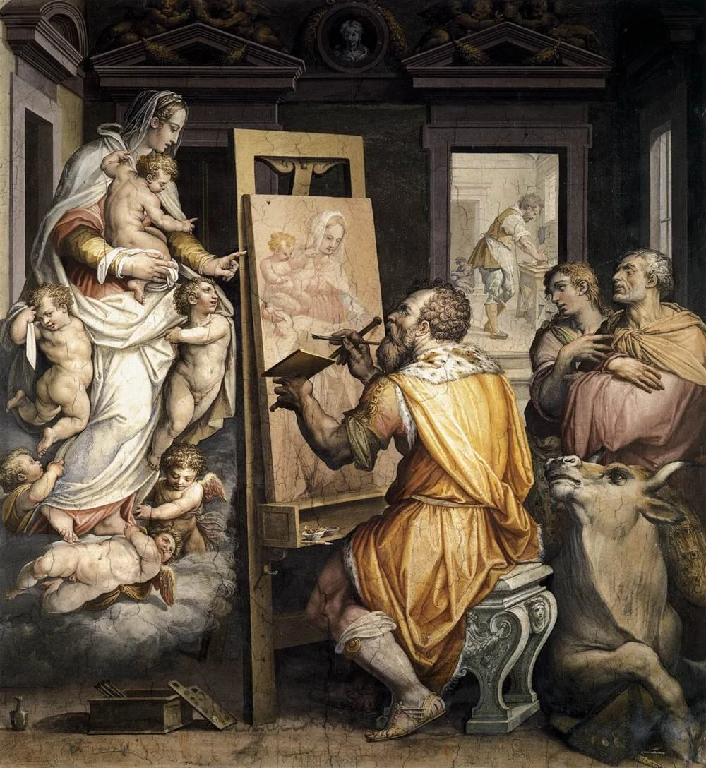
Saint Luke painting the Madonna, a fresco by Giorgio Vasari in the Santissima Annunziata Church in Florence
Image Credit: Wikimedia Commons
These works remind us that colour once meant commitment to change. The artist seemingly painted these works knowing that time would intervene.
Patina, Age and the Aesthetics of Duration
As artworks age, colour does not simply fade; it acquires patina. Varnishes yellow, shadows deepen, surfaces soften. In many cases, these changes have become culturally valued. We associate patina with authenticity, age and memory.
This is especially evident in oil painting. Old Masters’ paintings often appear warmer and darker than when they were first painted, due to the oxidisation of varnishes and altered pigments. While conservators debate restoration, viewers often feel emotionally attached to these aged colours. (Gage, 1999) (Pastoureau, 2012) Thus time itself, becomes the aesthetic. The same is true in architecture and sculpture, where weathered surfaces evoke continuity and endurance. Colour does not merely survive time; it visualises it. Think of the smoothed out areas of bronze sculptures, changed by time and touch.
Monet and the Serial Experience of Time
Few artists explored colour and time as deliberately as Claude Monet. Beginning in the 1890s, Monet produced series paintings depicting the same subject under different lighting conditions. His haystacks and Rouen Cathedral, and water lilies were not studies of objects but of time passing through colour. (Bomford, 1990)
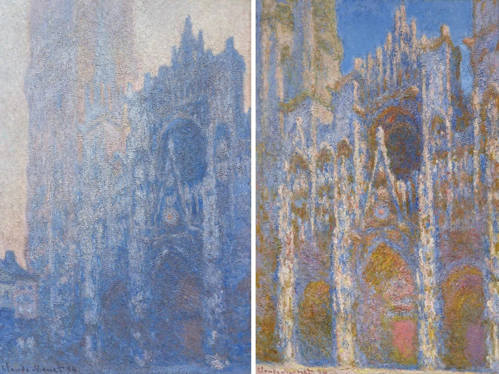
Left: Claude Monet, Rouen Cathedral Façade and Tour d’Albane (Morning Effect) (detail), 1894. Oil on canvas. Tompkins Collection—Arthur Gordon Tompkins Fund
Right: Claude Monet, Rouen Cathedral, Façade (detail), 1894. Oil on canvas. Juliana Cheney Edwards Collection
Image Credit: The MFA
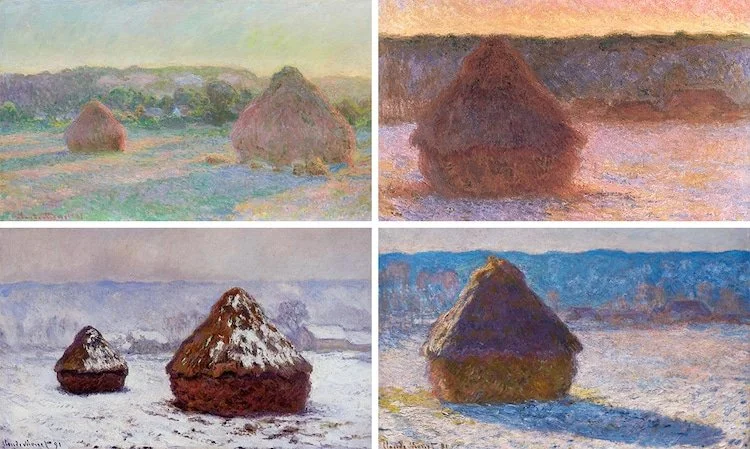
Claude Monet, “Haystacks (End of Summer),” 1890–1891
Image Credit: Wikimedia Commons via My Modern Met
Each canvas captures a fleeting moment: morning mist, midday glare, winter dusk. Colour shifts subtly from one painting to the next, recording atmospheric change rather than stable form. Monet’s serial practice rejects the idea of a definitive image. Instead, time accumulates through colour variation. Memory emerges not from a single picture, but from the relationship between many.
Modernism: Colour as Psychological Time
In the early twentieth century, artists increasingly used colour to express inner states rather than external observation. Time became subjective, psychological and fragmented. Artists such as Wassily Kandinsky believed colour could express spiritual vibrations and inner necessity. For Kandinsky, colour existed in time like music, unfolding emotionally rather than narratively. (Albers, 1971) (Kandinsky, 2002) Similarly, Mark Rothko used large fields of colour to create immersive temporal experiences. Standing before a Rothko, viewers often report a sense of suspended time, as if colour slows perception.
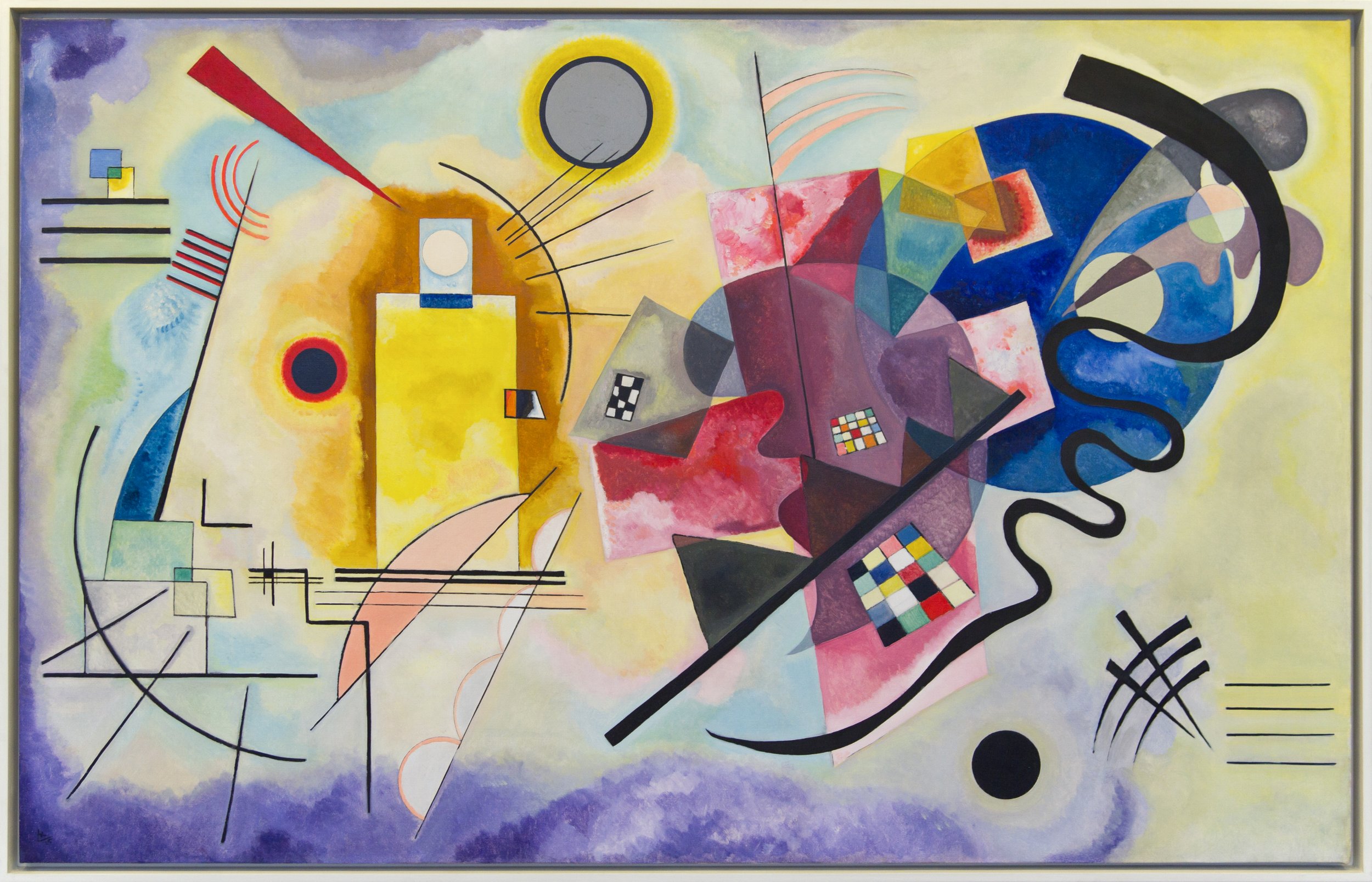
Yellow-Red-Blue, 1925 by Wassily Kandinsky
Image Credit: Wikimedia Commons
Colour does not depict time passing externally; it creates a temporal experience in the viewer’s body and mind.
Fugitive Pigments
Some pigments are inherently unstable. Known as “fugitive colours,” they fade rapidly under light exposure. Historically, artists often used them unknowingly. Today, some artists choose them deliberately. This decision reframes fading as meaning. Colour loss becomes part of the work’s life. Artists working with organic dyes, light-sensitive inks, or unstable chemicals accept that their work will change, sometimes dramatically. The artwork exists fully only for a limited time, after which memory replaces perception. This aligns with broader cultural concerns around ephemerality, ecology and impermanence. In contemporary practice, artists increasingly use colour as a dynamic, time-based medium. Some employ thermochromic or photochromic pigments that change colour in response to heat or light. Others use natural materials that decay, stain, or oxidise. These works make time visible. The viewer does not simply look; they wait, return, notice change.
Nostalgia and Colour Recall
Colour plays a central role in memory. Psychological studies show that colour enhances recall and emotional intensity. Artists have long exploited this connection. Faded photographs, yellowed paper and muted palettes evoke nostalgia precisely because they resemble the altered colours of memory itself. Artists working with archival imagery often mimic these chromatic shifts to suggest temporal distance.
Conservation ethics and the Digital Age of Art
As colour changes, conservators face difficult choices. Should faded pigments be restored? Should yellowed varnish be removed? Is the “original” colour more authentic than the aged surface viewers know? These debates reveal that colour is not only aesthetic but ethical. Restoring colour can erase time; leaving it can misrepresent artistic intent.
Museums increasingly present conservation as interpretation rather than correction, acknowledging that colour carries multiple temporal identities. Digital colour complicates these questions. Unlike pigment, digital colour does not fade in the same way. Yet screens age, software updates alter appearance and files become obsolete. Digital colour offers the illusion of permanence while remaining deeply vulnerable to technological time. Artists working digitally confront a different form of impermanence, one tied to systems rather than materials.
Pigments as a Measure of Time
Across history, artists have used colour to confront time’s passage. Whether through fading pigments, serial variation, immersive fields, or deliberate instability, colour has proven uniquely capable of holding duration, memory and change. Colour is never just what we see now. It is what has been lost, what remains and what will transform. To look at colour attentively is to look at time itself, made visible.
Sources
Albers, Josef. Interaction of Color. Yale University Press, 1971.
Gage, John. Colour and Culture. Thames & Hudson, 1993.
Gage, John. Colour and Meaning. University of California Press, 1999.
Pastoureau, Michel. The Colours of Our Memories. (Les Couleurs de nos souvenirs, translated by Janet Lloyd) Polity Press, 2012.
Kandinsky, Wassily. 1911. Produced by John Mamoun, 2002. Blackmask Online.
Bomford, David. Art in the Making: Impressionism. National Gallery, 1990.
Van Campen, Cretien. The Hidden Sense: Synesthesia in Art and Science. MIT Press, 2007.
Eastaugh, Nicholas et al. Pigment Compendium: A Dictionary and Optical Microscopy of History Pigments. Routledge, 1974.
Images
https://commons.wikimedia.org/wiki/File:Musei_vaticani,_ricostruzione_policromata_dell%27augusto_di_prima_porta.JPG
https://commons.wikimedia.org/wiki/File:Giotto_di_Bondone_-_No._31_Scenes_from_the_Life_of_Christ_-_15._The_Arrest_of_Christ_(Kiss_of_Judas)_-_WGA09216.jpg
https://en.wikipedia.org/wiki/File:Giorgio_Vasari_-_St_Luke_Painting_the_Virgin_-_WGA24311.jpg
https://www.mfa.org/article/2020/rouen-cathedral-series
https://mymodernmet.com/monet-haystacks/
https://commons.wikimedia.org/wiki/File:Kandinsky_-_Jaune_Rouge_Bleu.jpg
Cover Image
Black and Violet by Wassily Kandinsky, 1923
https://commons.wikimedia.org/wiki/File:Wassily_Kandinsky_Black_and_Violet.jpg