How to Make Space Disappear: The (Vanta) Black Hole
The Phenomenology of Colour
Celebrating light has always had much to do with its revelation of shapes and form.
Colour, temperature, hues, gradients, shadows. These coax the world into three dimensions and give real volume into what could otherwise remain flat shapes. Without them, everything might collapse and look like little more than thin lines sketched on paper.
It’s easy to see this in the works of the painters who understood it best. Rembrandt (1606-1669) used chiaroscuro to delineate bodies from darkness with sudden and dramatic flashes of contrasting light. Da Vinci (1452-1519) let those dark edges dissolve more softly through sfumato, so that flesh seemed to live and warm under the viewer’s gaze. J. M. W. Turner (1775-1851) is still admired foremost as a landscape artist, but it is hard to believe that what he was really painting was the landscape itself and not the atmosphere that held it together. Were his shifting gradients of sky and sea not, in truth, painting the light?
Mark Rothko (1903-1970) stacked rectangles of pure, saturated colour with indefinite boundaries that float against each other. He stained the canvas so that his brushstrokes rarely showed, yet one can still sense all of the streaks, patches, feathering and under-layers. The hues, saturations and intensities of the colours are never quite uniform: the colours feel active and space-making in their own right. But Rothko always rejected the “colour field” label that was so often thrown onto his paintings, because only appreciating their colour relationships was “missing the point”. “I’m interested only in expressing basic human emotions - tragedy, ecstasy, doom, and so on,” he has said.
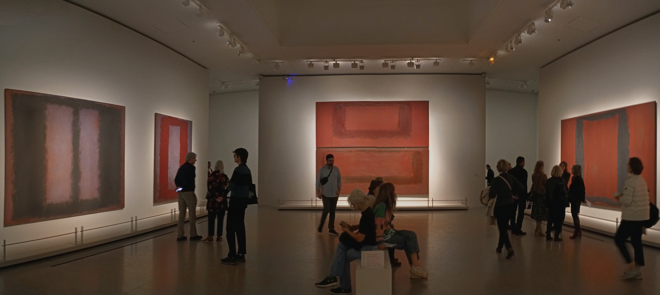
Rothko’s Seagram Murals at the Foundation Louis Vuitton (2003-2004)
Image Credit: Wikimedia Commons
“From a distance a Rothko painting can be pleasing and even pretty. If you walk up to it, you may find yourself lost in a smear of colors. If you step too close to a Rothko, you may find yourself inside it.” (James Elkins, 2024)
Light and colour make space. If so, then what happens in the absence of light?
In In Praise of Shadows, the author Jun'ichirō Tanizaki (1886-1965) wrote that even shadow - cast behind an object as it blocks the path of light - is neither emptiness nor blackness. It is its own subtle hue and depth. His reflections certainly offer a different way of seeing: a phenomenological reading that is rooted in the beauty and aesthetics of darkness, rather than the pure material or technical construction of a space. It is a cultural lens, yes, yet it still feels deeply valid.
Tanizaki’s observations opened the door for me to other ways of thinking about the phenomenologies of light. Juhani Pallasma (1936-) has written of this with a lot of care: how reflected light and colour act as mediators between the body and the world around it. How the slow shift from dawn to dusk tunes our inner circadian clocks and gives rhythm to our days, our lives. Colour, in this sense, is not decoration for the eye alone. It is time and it is orientation inside the larger order of things in our universe.
As an architect, I am constantly struck by the ways we know how to move through the spaces we construct without thinking, because light and colour keep telling us in their constant language where edges begin and end. Where surfaces recede and protrude. We feel present and maybe grounded even in a place because of all these small cues that colour and shadow give us, cues we might not even notice until, one day, they are gone.
A Colour That Destabilises
There is no question that colour stabilises, reveals, enlivens space. Even shadows are colour, as Tanizaki has reminded us. But what if colour gives way to something closer to non-colour? Not the rich, textured darkness Tanizaki praised in shadowed corners but an absolute absence that swallows every visual cue we know? Rational space, the kind we move through with easy familiarity, might fold or dissolve. What was once solid and orienting becomes a kind of void. In that moment, colour - of absence - can become a destabilising tool.
The closest “colour” that can do such a thing is Vantablack.
At its core, the material works simply and brutally. Not a pigment in the ordinary sense, it is actually a dense forest of carbon nanotubes, each one impossibly narrow and aligned like the trunks of microscopic trees. When light strikes the surface, it does not bounce back toward the eye. Instead, it enters the structure and is trapped, bouncing repeatedly between the tubes. With every deflection, more of the light is absorbed and converted into traces of heat. Almost nothing escapes. Up to 99.965% of visible light vanishes just like that. And that is why technically, some might not even call Vantablack a colour - an aspect of an object that is caused by the quality of light being reflected or emitted.
What makes this origin story even more fascinating is that Vantablack was not born on an artist’s palette but in the world of of aerospace and military engineering. It was originally created by Surrey NanoSystems in 2014 for satellites, telescopes, infrared cameras and other sensitive optical instruments to suppress stray light and therefore sharpen the sensitivities of sensors.
It was a colour meant for machines first.
But when brought down to the human scale, the effects are not the same. When light is swallowed whole, what is left to resolve our spatial perception? The usual grammar of highlights, hues, tones and shadows will fail to speak. Edges will lose their sharpness and depth will collapse. The eye which had become so accustomed to reading the world through gradients and volumes, will find itself groping in a space that has grown strangely unreadable and unnavigable.
Blackened Shapes and Spaces
The results have been extremely consequential for our perception. Objects coated in Vantablack appear eerily flat or worse, like holes cut into the fabric of the visible world. The brain, deprived of its familiar visual information, cannot resolve what it sees. What was once rational or recognisable collapses into abstraction, no longer a shape we know how to hold. The blackest black removes the very conditions that allow us to perceive space at all.
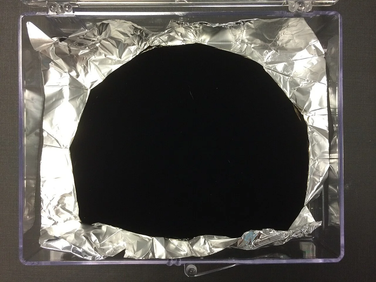
Vantablack painted onto aluminium foil
Image Credit: Wikimedia Commons
Light and colour are time. By absorbing all the light so completely, Vantablack also seems to suspend time. We lose our usual markers of duration and with them goes that cosmological orientation that tells us where we stand inside the order of the universe. Could it be that Vantablack opens onto something thanatopic: a world suggestive of absence and ending that exists, disconcertingly, within our own?
The Void in Art: Kapoor and Beyond
In a way, my own fascination with Vantablack - its extraordinary darkness rewriting the rules of colour perception - started with Anish Kapoor’s works. He took a colour born in the world of aerospace engineering and repurposed it into a colour for art. Unlike the original nanotube-grown coating, a sprayable version Vantablack S-VIS is more versatile and practical for artistic uses. It’s made the colour applicable on a wider range of surfaces and scales - and unsettling even more.
Kapoor has long sought the void and him securing exclusive rights to Vantablack S-VIS in 2016 was perhaps just another stride in that chase. “In the Renaissance there were two great discoveries: perspective and the fold,” he has said. Both gave the illusion of depth and life: the folds in fabric and flesh suggestive of breath and of being. His mirror sculptures like the iconic Cloud Gate (2006, better known as the “Bean”) in Chicago multiply space, reflecting (and distorting) the world around in infinite regressions. With Vantablack, he is able to remove the fold, the crease, any hint of three-dimensionality or “being”. It is the inverse strategy of his earlier mirroring work: no longer multiplying but making things disappear now.
“Painting is the giving of appearance to objects. I’ve been giving objects disappearance.” (Anish Kapoor)
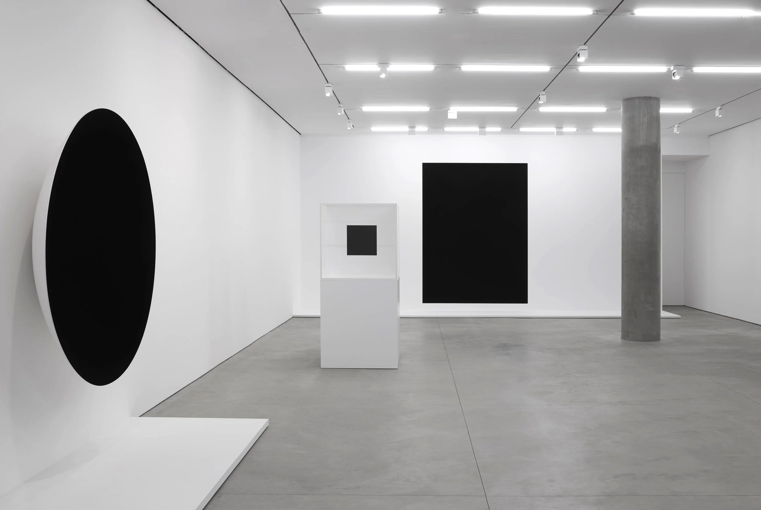
Exhibition view of ‘Anish Kapoor’ at Lisson Gallery, New York, 504 & 508 West 24th
Street, 2 November - 16 December 2023 © Anish Kapoor
Image Credit: Lisson Gallery
And it’s not just words. The power of that disappearance has been physical. In his Descent into Limbo (first shown in 1992 and later exhibited in various forms over the years), viewers encounter what first appears to be a perfectly flat black circle on the floor. Because there are no shadow gradations to indicate depth, our brain tells us that there is nothing more beneath it. Then in 2018, at the Serralves Museum in Porto, a visitor was so convinced by this illusion that he stepped on the black hole (in reality a deep, Prussian blue pigment) and actually fell into the real void below, injuring himself badly enough to require hospital treatment. The black hole was so dark that its three dimensions had collapsed into two. After that incident I doubt anyone can still question whether Vantablack can make space disappear.
In 2018, the architect Asif Khan brought the colour into even larger territory with the Hyundai Pavilion at the Pyeongchang Winter Olympics. The entire exterior of the structure - four parabolic walls rising over 10 meters tall - was coasted in Vantaback VBx2, another sprayable variant better suited to architectural scales. Whereas the black Kapoor has rights over uses microscopic stems to absorb light, VBx2 has a sponge-like structure at micro level. The light-absorbing pigmented coating is suspended in a carrier solution that allows it to be sprayed onto larger areas. From a distance, the structure looked like a sharpened black rectangle cut into the landscape. A window that opened directly onto outer space. Rods tipped with tiny white lights protruded from the ultra-black facade, giving an illusion of stars suspended in a void.
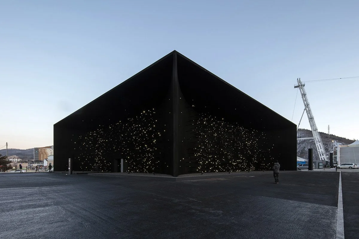
Khan’s Hyundai Pavilion at the 2018 Pyeongchang Winter Olympics.
Image Credit: Luke Hayes
Artistic Precedents: A Lineage of Absence
The colour Vantaback may be new, but the desire to negate space through colour - or non-colour - is not. In 1915, Kazmir Malevich painted Black Square, emptying (for the first time?) the canvas of any representation of the real world with what he deemed pure geometry and colour. In the 1950s, Yves Klein created the International Klein Blue to evoke the immaterial and nothing-ness, through colour. Then, in 1999, James Turrell collaborated with architect Tadao Ando on the Backside of the Moon in Naoshima. Inside a simple wooden structure, visitors are submerged in complete darkness. Light returns slowly, but only enough to confuse the senses. You lose all sense of where the walls begin or end because depth has disappeared and perception has come undone. I struggled to even walk in a straight line, uncertain of where the floor and the walls met the void, uncertain of the most basic spatial cues.
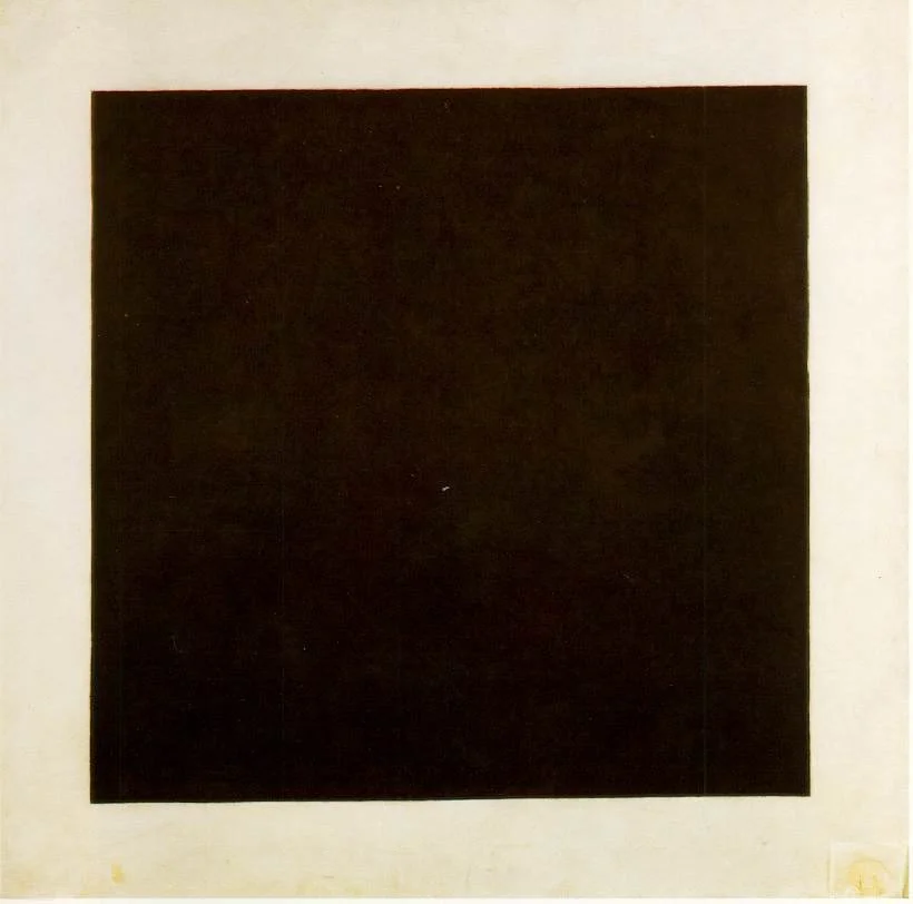
Kazmir Malevich, Black Square (1915)
Image Credit: Wikimedia Commons
I cannot help but think, is Vantablack the technological culmination of this long modernist pursuit? Those earlier artists relied on pigments, architectural constructions and even philosophy to suggest the black hole and the void. Now, Vantablack offers a new colour so black and so absolute that the disappearance is no longer philosophical. It’s literal. Where do we go from here?
Sources
Bachelard, Gaston. The Poetics of Space. Boston: Beacon Press, 2013.
Bhabha, Homi K. “Making Emptiness.” Anish Kapoor.
Merleau-Ponty, Maurice. Phenomenology of Perception. London: Routledge, 2014.
Pallasmaa, Juhani. The Eyes of the Skin: Architecture and the Senses. West Sussex U.K: Wiley, 2012.
“Rothko, Colour, and Expression.,” Truro College Art and Design, April 5, 2024.
“Statement about Art,” Daugavpils City Municipality Institution Rothko Museum, July 26, 2016.
Tanizaki, Jun’ichirō. In Praise of Shadows. London: Jonathan Cape, 1991.
“Ultra Black Paint.” Vantablack.
“Venice in Vantablack: Anish Kapoor’s Disappearing Act.” The Guardian, April 21, 2022.
Images
Mark Rothko, Seagram Murals, shown at the Fondation Louis Vuitton, Paris in 2024. https://commons.wikimedia.org/wiki/File:Mark_Rothko,_Seagram_Murals,_shown_at_the_Fondation_Louis_Vuitton,_Paris_in_2024.jpg
Vantablack. https://commons.wikimedia.org/wiki/File:Vantablack_01.JPG.
Black Square. https://commons.wikimedia.org/wiki/File:Malevich.black-square.jpg