Between Glaze and Reflection: Colour in Persian Architecture
Step into Iran’s historic palaces, mosques, and gardens, and one thing becomes immediately clear: colour is everywhere. In the heart of Shiraz, the Nasir-ol-Molk Mosque stands in silent awe at dawn. As light filters through its kaleidoscopic stained-glass and pastel tile panels, hues of blue, pink, yellow, and green dance across marble floors, an ephemeral world woven of light and colour. Travel north to Isfahan and the Sheikh Lotfollah Mosque greets visitors with its turquoise dome, where shifting sunlight transforms its ivory and azure tiles into living geometry. Across Naqsh-e Jahan Square, the Ali Qapu Palace astonishes with painted ceilings and delicate floral tiles, each chamber echoing with the playfulness of Safavid artisans. In Tehran, mirror halls of the Golestan and Saadabad Palaces fracture candlelight into a thousand shimmering constellations, while in Shiraz, the Vakil Mosque reveals a forest of spiral columns and glazed mosaics in vivid blues and greens. Even gardens speak through colour, at Hafezieh, domes and tiled pavilions sit among fragrant orange blossoms, where turquoise glimmers against the pink and gold of sunset.
Persian tilework, especially the vibrant Haft-rang technique developed in the 17th century, turns architecture into poetry through colour. But why these colours? And how did this art evolve alongside more ancient mosaic traditions like Mo'araq? This article explores how Persian architects and artisans used colour not just to decorate, but to evoke spirituality, identity, and emotional resonance.
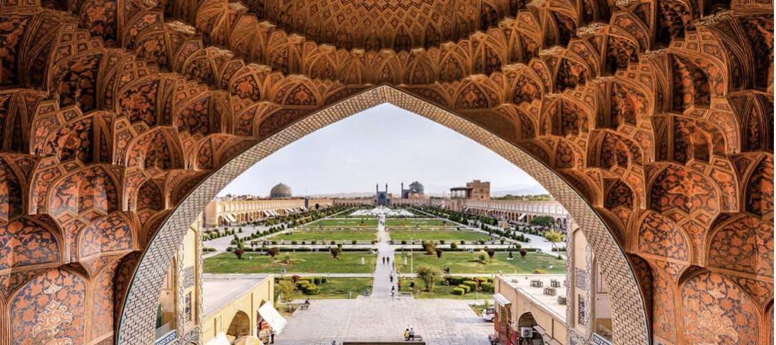
Naqsh-e Jahan Square, Isfahan, Iran
Image Credit: Wikimedia Commons, Author Amir Pashaei
Mo’araq (Cut-Tile Mosaic)
Where Geometry Meets Colour: The Mo’araq Tradition
Originating during the Timurid and Safavid periods, Mo’araq involved cutting tiny shards of single-coloured glazed tiles and piecing them together like a jigsaw to create complex designs. The result was more than decoration: it was colour given meaning. Shades of deep blue and lapis suggested the vastness of the heavens, evoking serenity and transcendence. Turquoise, often chosen for domes, symbolised renewal and protection, its luminous quality reflecting both sky and water. The frequent use of white, pure, clean, and light-bearing, balanced these tones, offering clarity amidst intricacy. Together, these colours reminded viewers of harmony between the earthly and the divine.
At Naqsh-e Jahan Square in Isfahan, this language of colour is written across stone and tile. The Sheikh Lotfollah Mosque glows in turquoise and ivory, colours that soften into warmer hues under changing sunlight, reflecting the Persian fascination with transformation and impermanence. Nearby, the Ali Qapu Palace carries delicate floral tiles in greens, yellows, and soft reds, evoking spring and the Persian garden, symbols of life, growth, and joy. These colours were never random; they were chosen to stir feelings, to make a visitor feel both elevated and embraced.

Tiles of Sheikh Lotfollah Mosque
Image Credit: Wikimedia Commons
Haft-rang (Seven-Colour Tiles)
Seven Colours, Seven Worlds
By the 17th century, artisans sought a faster method of decoration. Haft-rang, literally “seven colours,” allowed them to paint multiple shades on a single square tile before firing. These tiles often combined turquoise, azure, yellow, black, white, fawn, and red, a palette that became the emotional language of Persian buildings. The result was façades that seemed to glow with life, such as the Shah Mosque of Isfahan, or the tiled pavilions of Qajar-era palaces.
Each colour carried both symbolic and sensory weight. Turquoise and azure blues, perhaps the most iconic of Persian tiles, suggested infinity, the sky, and flowing water, inviting visitors into a space of contemplation and boundlessness. Yellow and gold radiated grandeur, echoing the sun and kingship, their brilliance amplifying the feeling of divine light flooding domes and iwans. Green, sacred in Persian culture long before Islam, spoke of renewal, fertility, and gardens, paradise transposed onto earth. Even the delicate pinks and purples that appeared in later Safavid and Qajar tiles softened the monumental stone, adding warmth and intimacy.
Walking through these spaces is to enter a carefully orchestrated colour symphony; blue calms, gold dazzles, green refreshes, red enlivens. Emotions shift as light strikes glazed tiles at different angles, creating not just architecture but a psychological landscape. In places like Sheikh Lotfollah Mosque or the Vakil Mosque of Shiraz, colour isn’t mere ornament, it is narrative, carrying centuries of ideas about beauty, power, spirituality, and the human need for harmony.

Nasir-ol-molk Mosque
Image Credit: Wikimedia Commons, Author MohammadReza Domiri Ganji
Mirror-Work: Ayeneh-kāri
Mirrorwork: Light as Colour, Colour as Light
If tiles anchor the viewer with colour, Ayeneh-kāri dazzles with light, and yet, it too is a story of colour. While the mirrors themselves were colourless, they were never experienced in isolation. Their brilliance was magnified by the colours of surrounding tiles, painted plaster, silk carpets, and even the clothing of those who entered the halls. The glass shards reflected and fractured not only light but also the dominant hues of Iranian aesthetics: turquoise, gold, emerald, ruby, and ivory.
Symbolically, the use of mirrorwork in combination with colour was deliberate.
Turquoise and Blue, when mirrored, became infinite skies, suggesting eternity, stability, and a link to water and heaven.
Gold was amplified into radiant halos of light, embodying power, prosperity, and divine presence.
Greens and Emeralds which are often used in textiles, tiles, and paint within mirrored halls, stood for renewal and paradise, their reflections rippling like living gardens.
Reds and Pinks shimmered like firelight, bringing passion and warmth into spaces otherwise dominated by cooler tones.
Together, these hues, fractured and multiplied by mirrors, immersed visitors in an emotional theatre: calmness and awe in blues, vitality in greens, reverence in gold, and intimacy in reds. Green and gold dominate the mirrored halls, suggesting both the abundance of nature and the authority of monarchy. Chandeliers scatter warm tones, bathing the mirrors in amber and crimson at night, transforming royal gatherings into celestial spectacles.

Āina-kāri in the main hall of Emarat-e Badgir in Golestan Palace
Image Credit: Wikimedia Commons, Author Diego Delso
Unlike the static patterns of tiles, mirrorwork is kinetic: colour and light respond to the viewer’s every step. A visitor dressed in crimson silk might find themselves multiplied across the chamber, becoming part of the artwork. In this way, Ayeneh-kāri was not just decoration but a participatory experience of colour, inviting each guest to see themselves inside infinity.
Sources
https://www.worldhistory.org/Persian_Seven-Colored_Tiles/
https://persianarcharchives.org/2022/02/04/persian-tile-arts/
https://www.youtube.com/watch?v=iuBv3k7K0uE
https://brewminate.com/seven-colored-haft-rang-tiles-of-ancient-and-medieval-persia/
Images
https://commons.wikimedia.org/wiki/File:Naqsh-e_Jahan_Square_from_the_gheisariye_Vault.jpg
https://commons.wikimedia.org/wiki/File:Iranian_Tiles_1.JPG
https://commons.wikimedia.org/wiki/File:Nasir_al-_mulk_mosque,_Shiraz.jpg
https://commons.wikimedia.org/wiki/File:Palacio_de_Golest%C3%A1n,_Teher%C3%A1n,_Ir%C3%A1n,_2016-09-17,_DD_27-36_HDR_PAN.jpg
Cover Image
https://en.m.wikipedia.org/wiki/File:Aina-kari_near_Zarih_of_Fatima_Masumeh_Shrine,_Qom,_Iran.jpg
Amir Pashaei - Own work