York Minster, Colour and Division

Exteriors of York Minster
Image Credit: Kieran Silk, @35mmofsilk on Instagram
York, a northern city, though full of diversity, is a Gothic town at heart. Situated closely to Whitby, the same sense of style, of Gothic complexity, tapers west to York. Now, you may recognise gothicism in the people here, adorned in fabrics and metals which represent a spectrum of Goth as subculture. Yet, most prevalent here is the northern Goth, of tattoos, old symbols, beards and brooding eyes. Architecturally, the environment is not dissimilar; there is much Medieval and Viking imagery to be seen, and aesthetics are often dark and crooked. In the heart of the city, towering over everything, is another kind of Gothic structure, the Minster Cathedral of York. The giant building, dating back to the Middle Ages, showcases the Early English, Decorated, and Perpendicular Gothic styles of the time. I went on a walk around the Minster with a guide who enlightened me to much of what can be discovered there. Upon entering the interior, I could immediately accept that the place is a trove of colour, and everywhere you look is something else to catch the eye. It may be the sun shining through the stained glass, the candles flickering on their stands, or a grossly complicated pattern on a tourist’s hat.
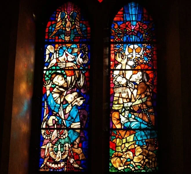
A stained glass window in the Zouche Chapel
Strikingly, the organ shimmers in brown and gold, directly ahead as you enter from the west. There are statues of religious figures in different styles, but all richly ordained with pigment. The walls are not dissimilar to the colour of sand, and all else is striking against it.
There is a low murmur of speech throughout the hall and footsteps shuffle and echo. Those who work there seem tidy, well-kept kept and mild-mannered, their clothing of quality, shoes typically of leather. Though I noticed, not many of the staff dress in bright colours, but rather suits and dresses in greys and browns. The whole place is immense, and the wealth is palpable.
I discovered, from my guide, that the colours that adorn the interior of the cathedral today are not entirely consistent with the colours that once decorated the walls long ago. During the Gothic period, around the twelfth and thirteenth centuries, the stone walls, now a deep white, would have been painted in an array of saturated colours. When you inspect certain areas closely, and especially around the sculpted parts, you can see remnants of old paint- bright reds, royal blues and subtle gold, likely gold leaf. These tiny pops of colour were happily missed when the walls were scraped around the nineteenth century. The vibrancy was seen as overly Catholic in such a Protestant time. Light and dark, whilst a significant theme in Christian parables, is also a well-constructed feature of religious architecture. In York Minster, you may see pillars of deep, glossy Purbeck marble in juxtaposition with the mass of pale, sandy stone.

A view of the interior
Image Credit: The Association of English Cathedrals
In the windows of stained glass, in each stunningly intricate mosaic panel, you can look on as light is welcomed, altered and changed. Those rich heraldic colours in the glass windows do not fade or alter over time, other than if the outside of the glass has been distorted by age, dirt, cracking, or lead bleeding. This, therefore, means you may receive a remarkably accurate impression of each window from eight hundred years ago. However, during those late Middle Ages, the strong colours you may now see around York Minster, colours we may take for granted now, would then have been only accessible to the rich, the church and the aristocracy. I imagine that those deep and wonderful colours, whilst inviting people to come to the church, would also have been used to gatekeep.
Colour, rare colour, less readily found in nature, was kept by those in power. It was used to varnish the shields and the windows of the churches, distinguishing the symbols which they depict, and the ideas they represent, as their own.
Colour was a visual and material divider of the social hierarchy. Those with less would be able to afford only undyed or cheaply dyed fabric, with colours of the common earth. Yet those with more could most certainly afford a saturated wardrobe and, happily, a dramatically painted wall.
Colour now, however, is not so dividing, right?
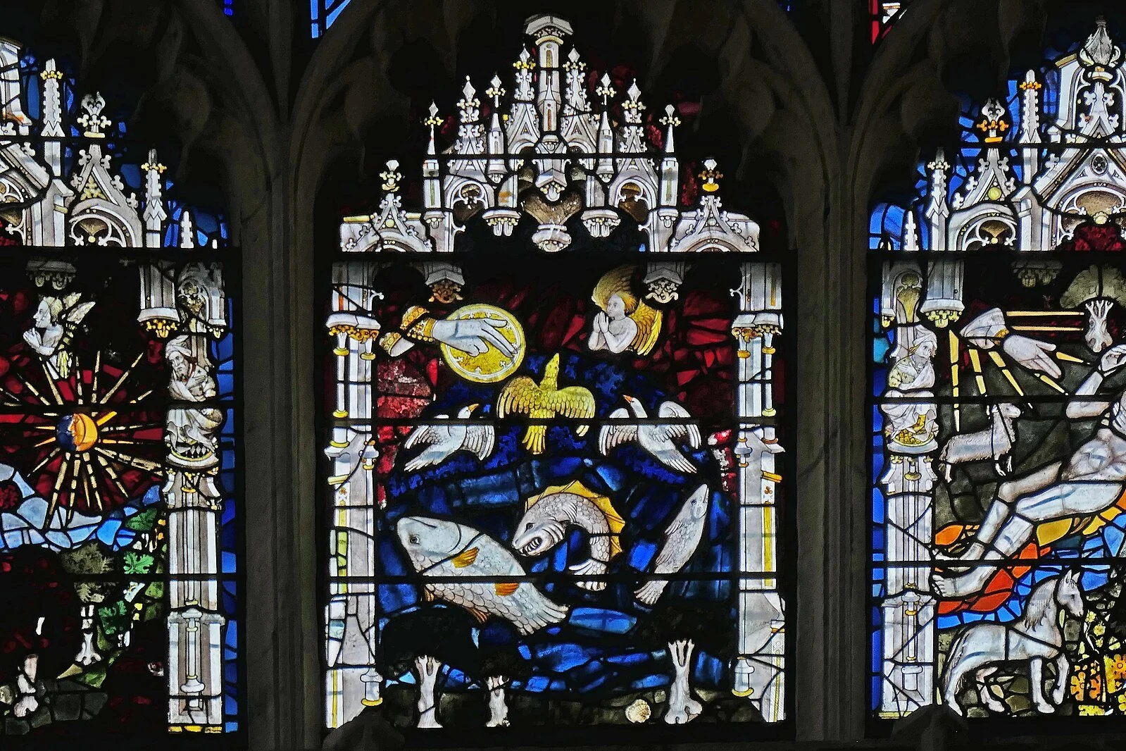
A section of the Great East Window
Image credit: Wikimedia Commons
As I was walking with my guide, he mentioned that the great east-facing window of York Minster had very recently been renovated. The mosaic pieces were separated, and a percentage of them were then refitted with glue rather than the original lead. The window, when you see it now, is therefore clearer, cleaner and less complicated by sectioning. It is beautiful, and yet it is a privilege.
I suppose that colour within the context of wealth and hierarchy is also divided by what you can’t see. York Minster has the means to pour money into invisible glue and protective layering, which declutters and brightens their windows, making the old colours shine.
I think that colour still marks us culturally, reflects our social structures and alludes to who we are within them.
As I left York Minster, I felt very much that I’d like to go back. Not because of any faithful affinity, more that I’m a sucker for some good feng shui, and a fan of an extravagantly decorated interior.
Images
https://www.instagram.com/35mmofsilk/
https://www.docbrown.info/docspics/yorkscenes/minster/ZoucheChapel.htm
https://www.englishcathedrals.co.uk/cathedral/york-minster/
https://commons.wikimedia.org/wiki/File:Great_East_Window_York_Minster_-_51982100474.jpg
Cover Image via York Glaziers Trust
http://www.yorkglazierstrust.org/
@yorkglazierstrust