Chromatic Notes from Frieze
In the past weeks, Frieze Art Fair took place for art lovers and the city was filled throughout the week with art events, open studios, and exhibitions. In addition to seeing all the works, every year I choose a theme to focus on for myself and this year my theme was colour again! In a space full of visuals, materials, objects and people, I created a map in my mind so as not to get lost, my eyes searched only for works in which colour is the primary tool.
Frieze Art Fair
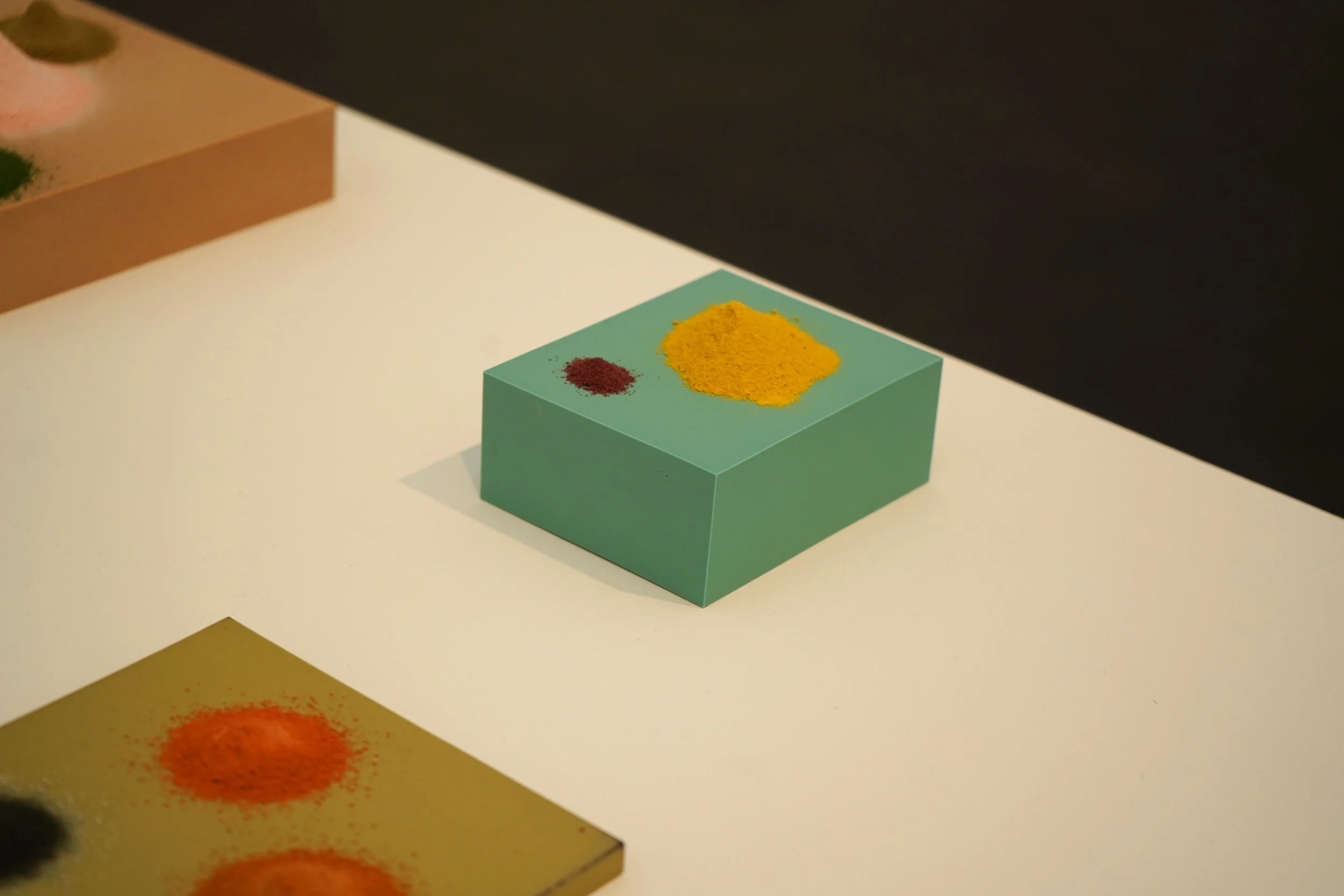
Sam Bakewell, Individual works from the Dust series, 2025
Photograph by Richard Sturges
I came across a few works that made me pause and reflect on colour and its effect on individuals. It struck me how a single piece can evoke thousands of different feelings and how each viewer’s response is unique. What’s fascinating is that we can see the same colour, even before or without fully engaging with the object and yet feel entirely differently. Colour is deeply personal, shaped by the emotions and memories each of us associates with it. While our perception of the colour itself may be the same, the thoughts and feelings it triggers are entirely individual. In this sense, colour acts as a bridge between the artist and the audience, allowing a unique dialogue to form through a shared visual language.
When considering perception, Sam Bakewell’s work draws attention through its attentive craftsmanship. In the Dust series, the delicate piles of powder appear as if they could be blown away at any moment, creating a sense of fragility. The carefully chosen colour contrasts draw the viewer closer, encouraging a closer look at the fine details.
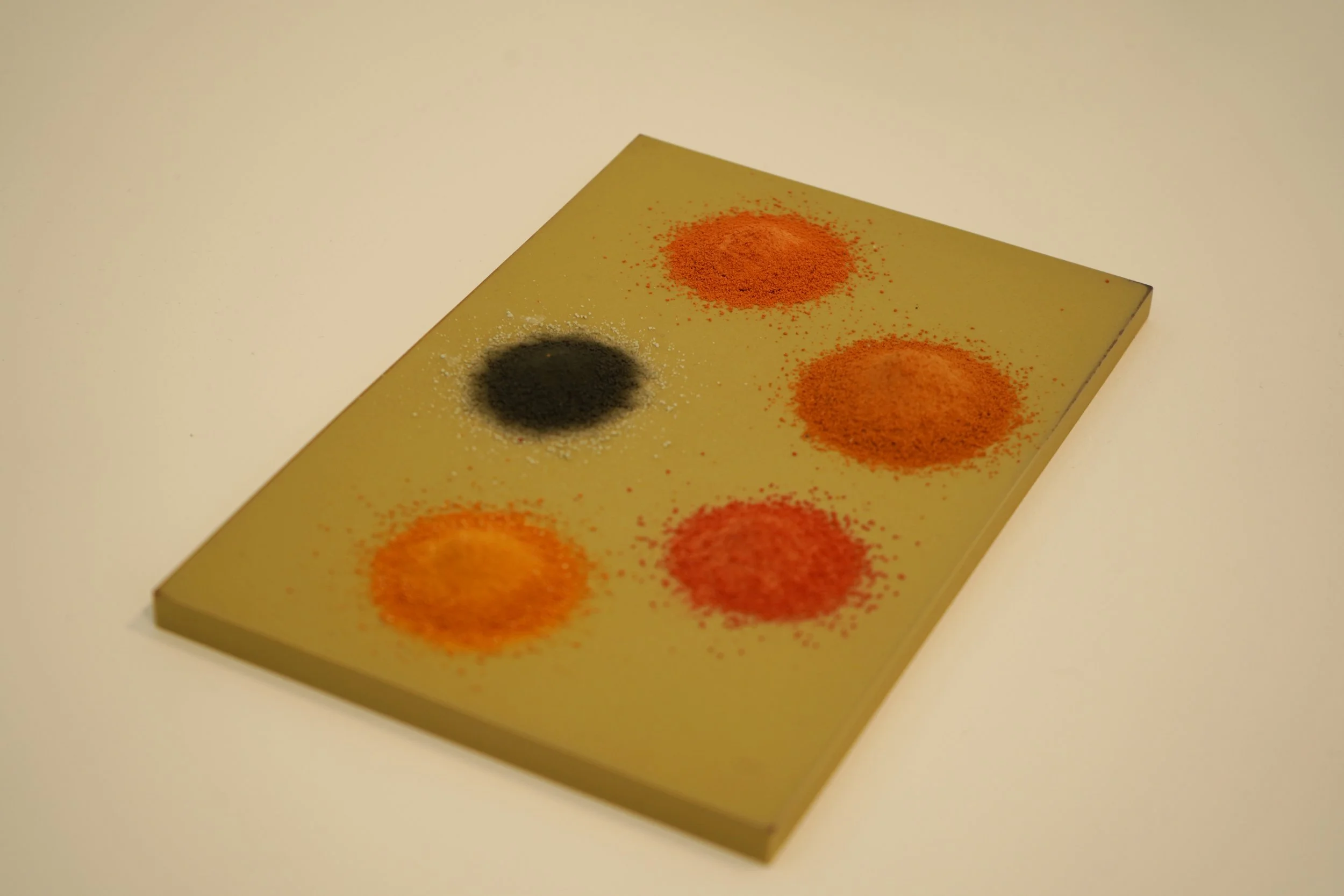
Frieze Art Fair
Sam Bakewell, Individual works from the Dust series, 2025
Photograph by Richard Sturges
Another work that captured my attention was Rana Begum’s series of acrylic paintings. They offered a striking example of simultaneous contrast, a visual effect where the colours of a shape seem to change depending on the tones around them. Each colour combination appeared to shift in hue and intensity based on its neighbours, making it difficult to focus on a single canvas, especially because the pieces were placed so close together that they felt like they wanted to be experienced as a whole. When layered or contrasted, the colours could either become more intense or soften, creating moments of energy or calm.
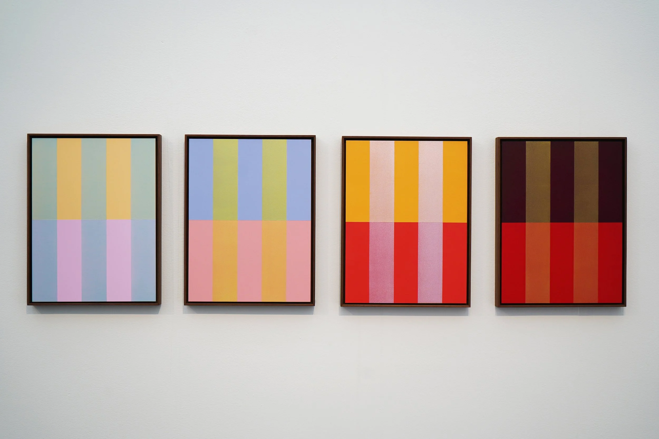
Frieze Art Fair
Rana Begum, No.1506 - No.1505 - No. 1504 - No. 1502 Painting,2025
Photograph by Richard Sturges
Even though each year Frieze can feel like an overwhelming art business market, art isn’t just something we buy. It’s something that makes us observe; ourselves first and then others through the artwork. It’s something we navigate, interpret and claim. But sometimes, it’s quiet in the loud, single in the crowd, confusing even though its meanings are written. Sometimes it’s just colour; a language meant to be understood or not. It’s private. Yet, colour is where we meet another, where we perceive each other more clearly. Colour speaks beyond words and images.
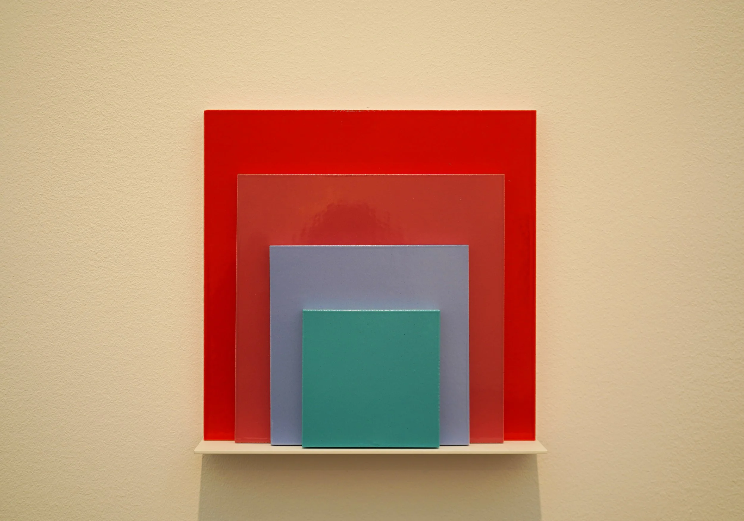
Frieze Art Fair
Jose Dávila, Homage to the Square, 2023
Photograph by Richard Sturges

Frieze Art Fair
Cornelia Parker, Putin's Endgame, 2025
Photograph by Richard Sturges

Frieze Art Fair
James Hugonin
Photograph by Richard Sturges