Colour as a Universal Medium in De Stijl and The Rietveld Schröder House
In 1917, De Stijl was founded by Theo van Doesburg in the Netherlands. De Stijl, which means “The Style” in English, was founded in the backdrop of the First World War. Around the Netherlands, a neutral nation, Belgium, Franceand Germany were being ravaged by intense warfare. The founding members of De Stijl saw their vision for art and design as defiant to the culture of individualism that had led to the outbreak of the First World War. The first statement in De Stijl’s manifesto claims that “There is an old and new consciousness of time. The old is connected with the individual. The new is connected with the universal.” Colour in design and art was of key interest to the members of De Stijl, who rejected the cultural individualism and the development of intense nationalist sentiments that had led to the First World War. The group desired to establish a universal method of communication through art and design. Crucial to this was the reduction of colour to its simplest tones.

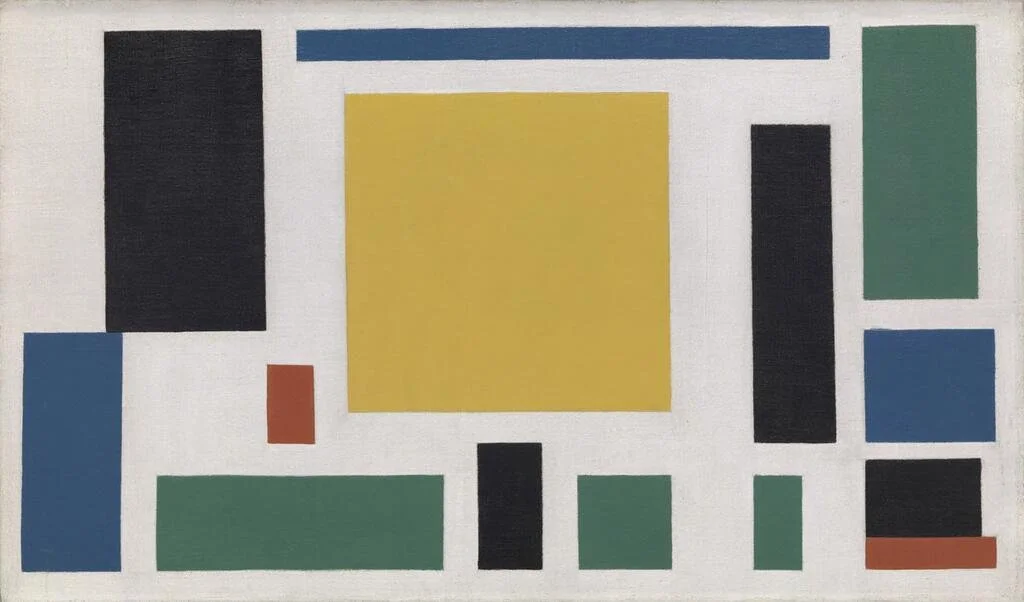
Piet Mondrian, Composition with Red, Blue, and Yellow, 1930
Image Credit: Wikimedia Commons
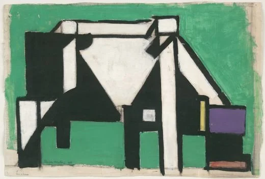
The paintings of Piet Mondrian exemplify this philosophy of universal communication through a reduction of mixed colour down to its primary components. Red, Blue and Yellow, with shades of black, white and grey, are organised in a range of unique patterns, which do not necessarily repeat, but are constructed using consistent right angles. Mondrian had been creating works that used this kind of abstraction since around 1915, but his later works in association with De Stijl, such as Composition with Red, Blue and Yellow, from 1930, separate the primary colours from one another with thick black lines. The black lines reach to the edge of the canvas, giving the impression that the structure of the painting could extend out infinitely. The separation of colours, ensuring that they do not mix, represents De Stijl’s desired interaction of colour. All of this contributes to a universal method of communication through accessible, simple colour. Other painters in the group demonstrated the reduction of colour and form that could result in representations of this type. Theo van Doesburg’s Composition VIII (The Cow), from 1917, is an excellent demonstration of the reduction of form and colour to create imagery that communicates universally. Composition VIII depicts a grazing cow, with its udders and lips represented in red blocks and its body in yellow and black. The Museum of Modern Art in New York holds some of the preparatory sketches for the work, which show van Doesburg’s process of sketching the animal, separating its body into distinct rectilinear forms and plotting charcoal and gouache the position of colours in the composition. Composition VIII does use green to depict the grass on which the cow grazes, but the colour is formed by a precise mix of two of the primary colours that form the majority of the composition. For all De Stijl painters, the mixing of colour indicates an interpretation of the depicted subject that is inherently individualistic. The reinterpretation of the subject from the artist’s eye to the mixed paints to the canvas imbues in the completed composition some element of culturally-influenced interpretation that strips away the universal characteristics of the subject. Yes, the compositions of De Stijl painters are abstract and difficult to understand without the context of what the composition represents, but these compositions deliberately do not represent anything more than the inherent characteristics and colours of the subject. This contributes to the creation of a universal language of art and design, which removes the potential for miscommunication and culturally-specific interpretation.
Theo van Doesburg, Composition VIII (The Cow), 1917
Image Credit: Wikimedia Commons
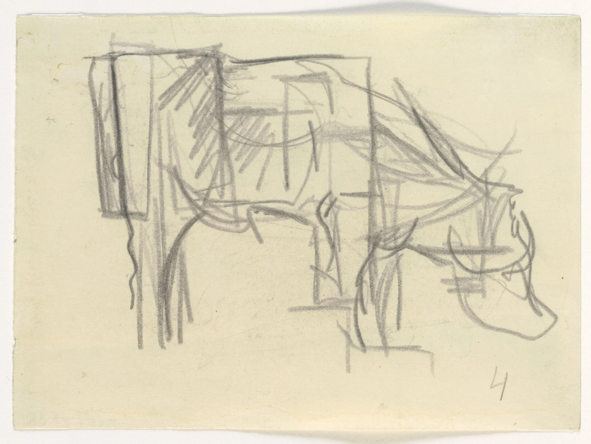
Theo van Doesburg, Preparatory sketch for Composition VIII (The Cow), 1917
Image Credit: Wikimedia Commons
Theo van Doesburg, Preparatory sketch for Composition VIII (The Cow), 1917
Image Credit: Wikimedia Commons
Yve-Alain Bois draws attention to the relationship between the De Stijl painters and architects; both those affiliated with De Stijl and those after. He notes that architects working during the publication run of De Stijl’s journal from 1917-1933, such as J.J.P. Oud, Mies van der Rohe, and Philip Johnson, were inspired by the work of Mondrian in their work, both in the presentation of their architectural plans and the appearance of their completed works. The clearest example of the painting of De Stijl inspiring an architectural work is in Gerrit Rietveld and Truus Schröder’s 1924 house in Utrecht, Netherlands. Rietveld designed furniture and worked on architecture projects, which hold to the values of De Stijl painting while transforming its forms into inhabitable spaces. In his overview of De Stijl and the architecture of Rietveld, William J. R. Curtis summarizes perfectly the special attention that Rietveld gave to the extrapolation of the two-dimensional work of De Stijl to architectural design. He claims that “ Rietveld grasped most clearly the three-dimensional implications of such a geometrical abstraction. The general aim was not to decorate the modern building with painted murals, but to treat it as a sort of abstract sculpture, a ‘total-work-of-art’, an organism of colour, form and intersecting planes.” The home was designed for Truus Schröder and her children to live in. Schröder was a widow whose previous marriage had been tested by her and her husband’s differing outlooks on how their children should be raised. Schröder’s sister, An Harrenstein-Schräder, was a writer and critic who socialized with Dutch socialist politicians and artists, frequently involving Schröder in their meetings. After her husband’s death, Schröder began a relationship with Rietveld and the couple sought to design the home together as an environment where Schröder’s children could be raised to understand the value of shared space, communication and a close relationship with their parents. The house functioned as an expression of Schröder and Rietveld’s democratic ideals and the use of colour inside it operated in the same way as De Stijl’s painting and design work, promoting a universal communication and shared engagement with abstraction.
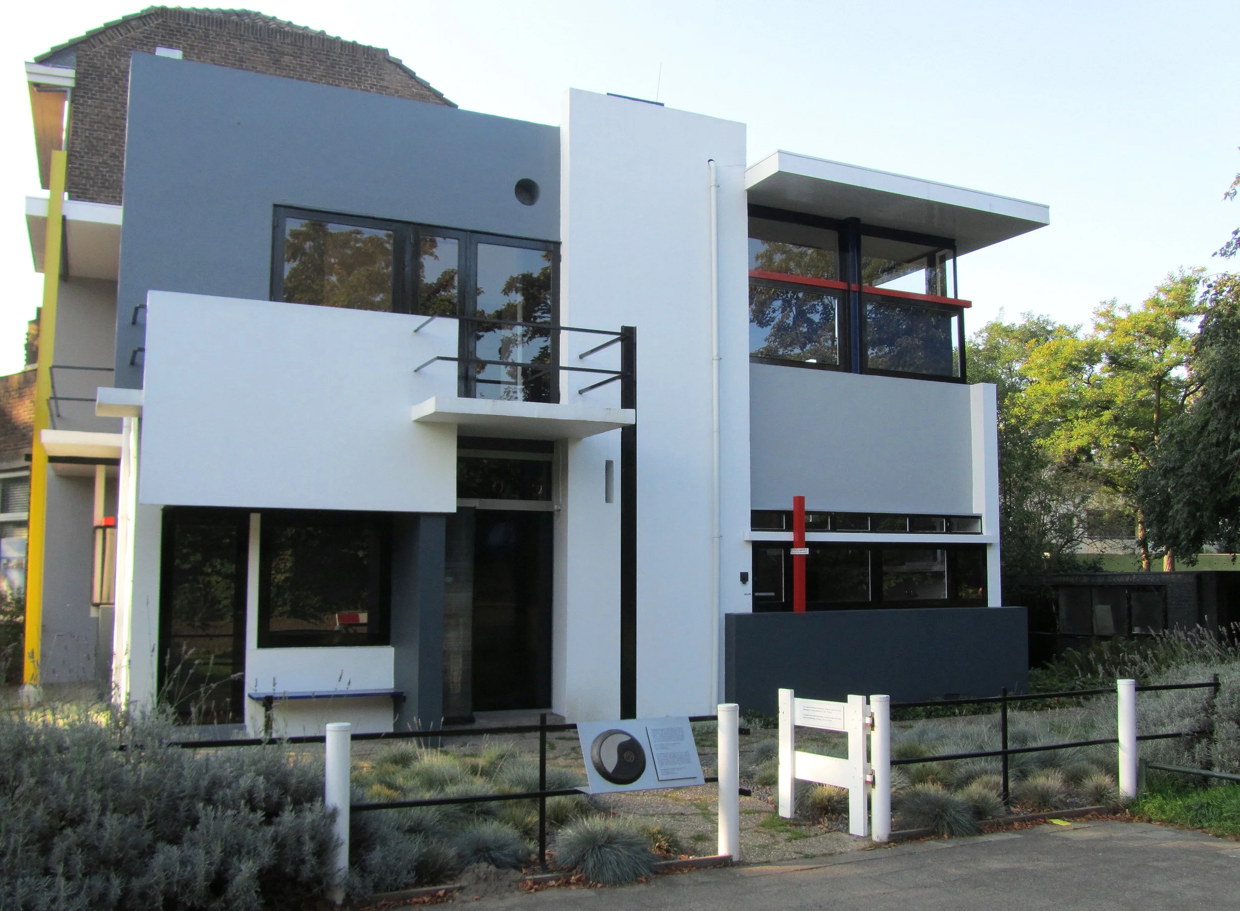
Gerrit Rietveld and Truus Schröder, Exterior of Rietveld Schröder House, 1924
Image Credit: Wikimedia Common
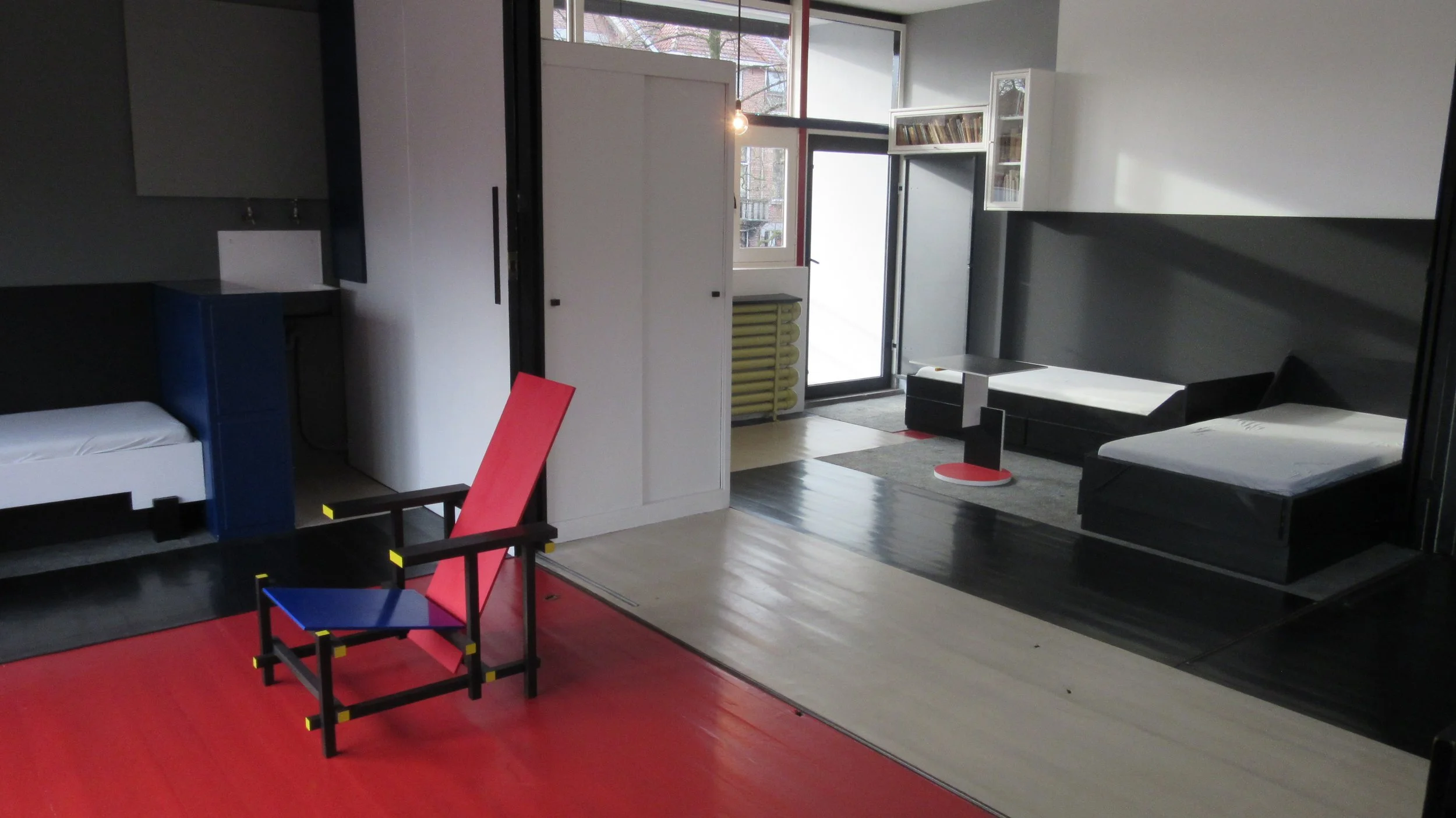
Gerrit Rietveld and Truus Schröder, First floor interior of Rietveld Schröder House, 1924
Image Credit: Wikimedia Commons
Alice Friedman gives a more in-depth explanation of Truus Schröder’s involvement in the creation of the house and the political relationships that shaped her outlook on the function of space in a family home, in contrast to the restrictive architecture of traditional urban housing that accommodates nuclear families. Friedman’s description of the home emphasises the bold colours used to paint the structural supports of the facade and the movable interior walls. She describes “Metal strips, lengths of wood and bits of tubular steel painted bright red, blue, yellow and black, which provide a sort of framework for the roof, walls and windows, thin planes that never meet at the corners but appear to be propped together in an elegant yet strangely precarious composition.” Friedman also makes the connection between the house and the work of Mondrian regarding the use of colour, but she claims that the house goes beyond the “cerebral investigation of form” in Mondrian’s works to experiment with the use of space in an “impulsive and joyful” way. The notion of an “organism of colour” described by Friedman is pertinent to the organisation of space in the home. In the upper floor of the house, used as a living room, dining room and bedrooms for the children, the central walls that form the separate spaces of the rooms can be moved in and out, creating one large shared room. The children could choose for their rooms to be open or private spaces, giving them the freedom to decide their level of interaction with the social areas of the house. It is on this upper floor that the transformation of the paintings of De Stijl into a three-dimensional form is best achieved. Each of the floors that designate a different room is coloured according to the different colours of Mondrian’s compositions. These blue, white and red floors are separated by black rails that the walls can extend out across. The closed walls also create their own white rectilinear forms, like the compositions of Mondrian. This separation of space, signified by the separation of colour in the house, creates its own universal method of communication. The presence of each colour in the house indicates a desire of each inhabitant for privacy, creating a visual language using the colours of the space.
Sources
Barr, Alfred H. “De Stijl.” The Bulletin of the Museum of Modern Art 20, no. 2 (1952): 7–13. https://doi.org/10.2307/4058213.
Bois, Yve-Alain. “Mondrian and the Theory of Architecture.” Assemblage, no. 4 (1987): 103–30. https://doi.org/10.2307/3171039.
Friedman, Alice T. “Family Matters: The Schröder House by Gerrit Rietveld and Truus Schröder.” In Women and the Making of the Modern House: A Social and Architectural History (Abrams, 1998), 64-91.
Van Doesburg, Theo, et al. “Manifest I of ‘The Style,' 1918.” De Stijl, Vol. II, no. 1 (November 1918), 4.
William J. R. Curtis, “Cubism, De Stijl, and New Conceptions of Space.” In Modern Architecture Since 1900, 3rd Edition (Phaidon, 1996), 149-159.
Images
https://commons.wikimedia.org/wiki/File:Theo_van_doesburg_de_koe.jpg
https://commons.wikimedia.org/wiki/File:Cow_by_Theo_van_Doesburg_Museum_of_Modern_Art_227.1948.3.jpg
https://commons.wikimedia.org/wiki/File:Rietveld_Schr%C3%B6derhuis.jpg
.jpg)