Laura Perryman: Colour Designer + Forecaster
We often think about where our food comes from. We run it through the lasers of our mind, trying to trace its origin and judge whether its journey aligns with our values. Now think about colour in the same system. Would it matter if a colour carried the warmth of summer or the stillness of autumn? Or whether the plant used in its production was thirsty or well-nourished? You might not. Colours can seem like dead things we can claim, just a material made alive through the generosity of light, yet creatives have to think about all of this.
In conversation with Laura Perryman, this idea of colour as something fluid begins to take shape. Perryman describes colour not as a fixed identity, but as an experience, one that is shaped by origin, context and perception. Each person encounters it differently and even the smallest change in material or environment can alter what a colour becomes. Rather than something we simply define, colour emerges here as something we continuously discover.
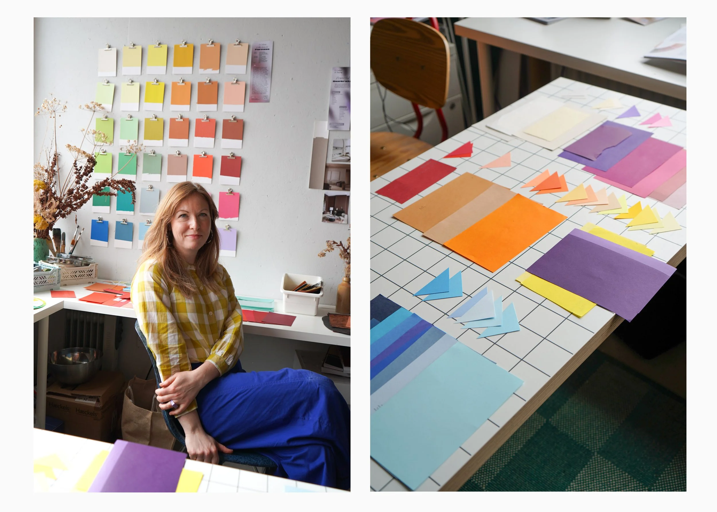
Laura Perryman at Colour of Saying, Colour & Material Research Studio
Photograph by Zeynep Sagir
How can we define the nature of a colour if it is subjective? When we define a colour, don’t we also take away part of its mystery?
I think it's important to help everyone understand the nature of colour and often by applying language or terms, helps to define it. My standpoint is to encourage as many designers and people to use colour. Language doesn't need to be universal, not everyone will call a deep red a deep red, but by giving it a value or a quality we can begin to understand it.
I don't think this takes away its mystery, instead by giving it language helps us fall in love with it even more.
Once a colour is given a fixed meaning or identity, doesn’t that limit its element of surprise?
Surprise can also be attributed to context, when we apply colour to an object, product or surface we are enhancing its persona/identity and emotional qualities. Surprise can also be designed or explored creativity in an application. Such as a hidden element of a rich red colour underneath, or a completely discordate acid shade inside the cover of a book.
How can we expect colours to exist in a more creative, fluid way if we’ve already labelled and shaped them? And how do we continue to create new art with a colour that feels already discovered and understood?
Depends how you define creative and fluid. Material behaviours and narratives often change the nature of colours. When colour is part of a material surface it can behave in very different ways. In a high gloss finish - an aqua blue can behave like the ocean, while if it's a tinted layer on a woodgrain, it can appear solid and stable.
I think artists and designers make these choices about colour for completely different reasons, which is quite fascinating. Artists often spend time conceptually; with the emotional and conceptual side of colour, sometimes for years or decades, exploring it through materials for wildly different reasons. While designers do explore colour, but often frame it in context much quicker, try to resolve it in an application, but sometimes miss the true emotional and semiotic meaning of why that shade.
In the Colour Bible, you write: “Every colour profile starts from the colour’s origin, then tracks its evolution.” I believe it is during that evolution that “colour requires a level of nuance in approach,” especially if “colour is intrinsic to the human experience.” You also quote Johann Wolfgang von Goethe: “Colours and light stand in the most intimate relation to each other.” If each of us receives and processes light in our own way, then we may each understand a colour differently. So how can we ever have a shared or normative understanding of a colour? If we might all see it in slightly different shades, how can we confidently define it?
I would respond with 'Is it only seeing that defines colour?' We experience colour via memory, very fundamentally, but also the time we've spent with a colour has a bearing and even without naming a colour, we can innately respond to it. Colour can be so many things to different people and that's the beauty of it. Commercially, what's the value in marketing specific colours? that not everyone can perceive as that one colour? These are important in the context of the commercial colour industry in which I work. Often we want to entice people with stories of colour, because really it's that element that people connect with.
Do we all really need to have our colour fixed for us? And do we really view it like that anyway, as do you see the yellow that I do, in the same way? We'll probably never know. But it would have been interesting to be in the shoes of those who first brought the a red-yellow fruit, to the shores of England, and declared this is Orange!
And for someone who wishes to express themselves through colour, is there ever a risk-proof approach? Or is uncertainty always part of the language of colour?
There's no right or wrong, just discord or harmony. I think you have to decide where you sit. It is co-ordination or rebellion?
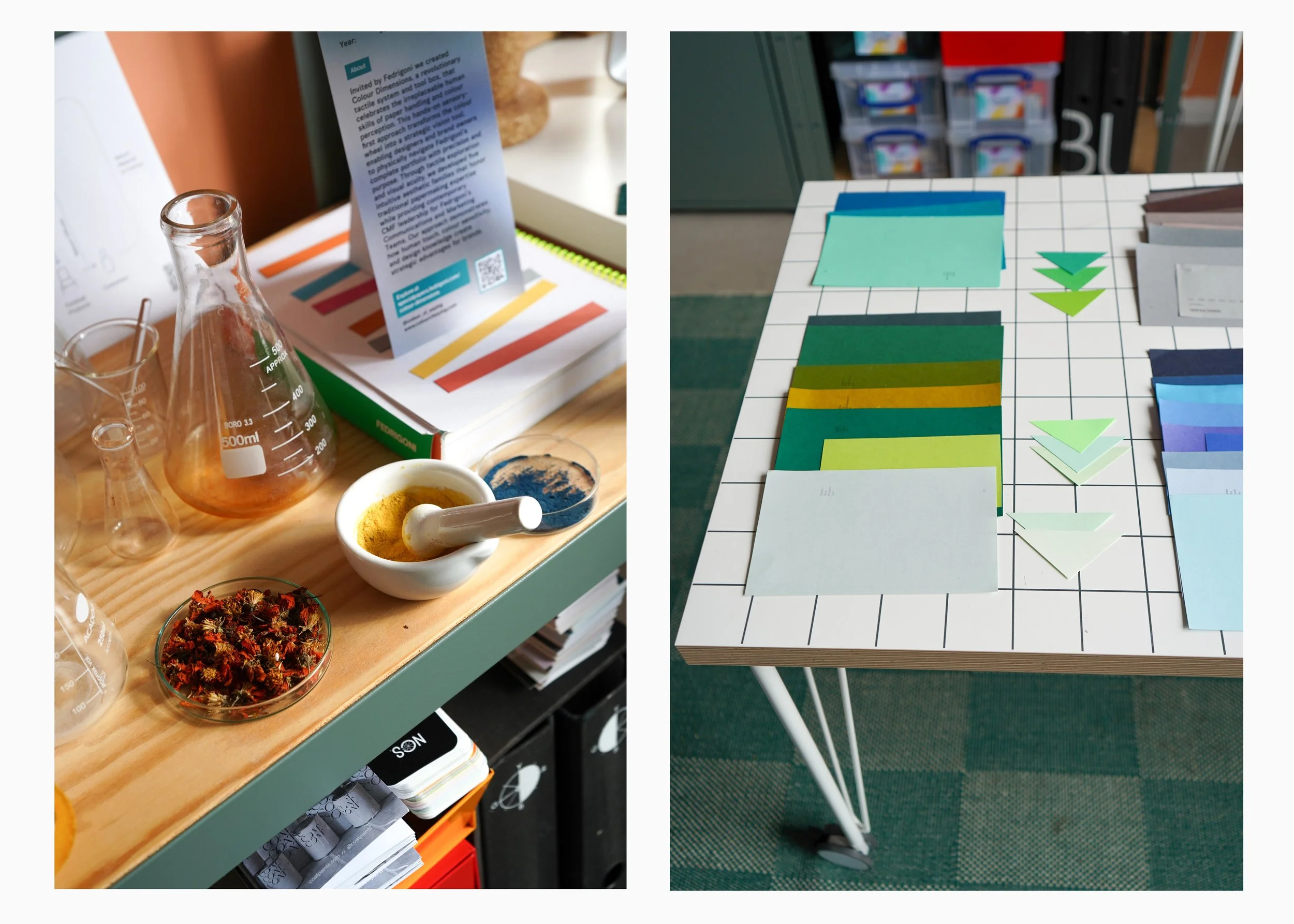
Colour of Saying, Colour & Material Research Studio
Photograph by Zeynep Sagir
You once referred to a particular colour as ‘the saddest colour.’ What does sadness mean to you in chromatic terms?
Chromatically I think it's colours that look deeply detached. Often cold colours seem less inviting. The colour in the book, in reference to (I think!) is in a very famous Picasso painting, one of solitude, loss and sickness. A deep greeny-blue that's on the turn. Feeling blue, is a long held association or connotation. But not all blues are sad, far from it, many are sky blue optimistic and light reflective.
What makes a colour be considered the saddest of all? Is there something inherent in the colour itself that codes it with emotion, or is that feeling something we project onto it?
I think colours that are saddest perhaps have no or very little chromatic levels in them, duller colours can look more subdued. Grey has always been a pretty sullen colour territory. But we know that, when there is no light there is no energy. Colours radiate energy levels, as know they can be read by nanometers on the visible light spectrum, but there is a long history of colour therapy and link to colour and higher wellness states, healing and even our metabolic states and sleep patterns. Of course we connect with colour emotionally, but also without knowing - through our physiological needs too. You feel low energy, so you look for signs of spring colours, when you start looking they pop up and appear, because your nervous system and your brain is looking for them.
Should we think of colours as having emotions attached to them? If so, are these emotions reflections of the source that created them, or do they exist independently, belonging only to the colour as it appears in its current form?
There are many sources that give colour general emotional connotations, such as passion for red, stillness for white etc and in many ways these are useful as a broad understanding. But two things are worth considering, one is context and the other is qualities. When we apply colour in context the absolute change in scale and completely change perception, a cute pink in a bow can suddenly feel quite sickening when on every single surface around us. Qualities are important too for emotional read, a sleek surface or a woven textile, both say something completely different. And that's why colour is never just in isolation.
When a colour comes from something that has stopped growing or is no longer alive, can it still carry emotional meaning beyond that ending? How does it continue to exist and affect us after its origin has changed or disappeared?
Yes absolutely. Sometimes that fading still creates a memory. Even after you pick freshly cut flowers, they dry over time and the colour alters, shades lighter or browner perhaps. However this is not just what is shaping your 'lived' memory of that colour, texture is too and also the memory of picking it, the time you spent and the day itself, even the light. This builds a colour memory or experience.
You’ve suggested that different stages of the source material produce different shades. How does transformation alter the emotional or symbolic value of colour in your work?
Transformation is a very important topic for colour designers and CMF designers too. Colour is the tool kit to extend the life of an object or design. I like to explore transformations of colour in different ways, sometimes with natural inks and pigments as they state change with PH or time, or season and simply create a fascinating resource of physical, but sometimes fleeting moments of colour.
How does this affect the emotional reflection of the colour? Can we identify what type of emotion each shade conveys and does this perception vary between people or is it universal?
Yes I think you can. Emotions are close to qualities, if it looks soft, dull, light, heavy we can begin to navigate the emotional levels within the colour. Of course is emotion exclusively universal? No, I would say not. But I would add that nuances, are important. A little bit more yellow than brown, a little bit more acid, than earthiness. They give us different flavours or notes on a scale - if we tune into them we read them in different ways.
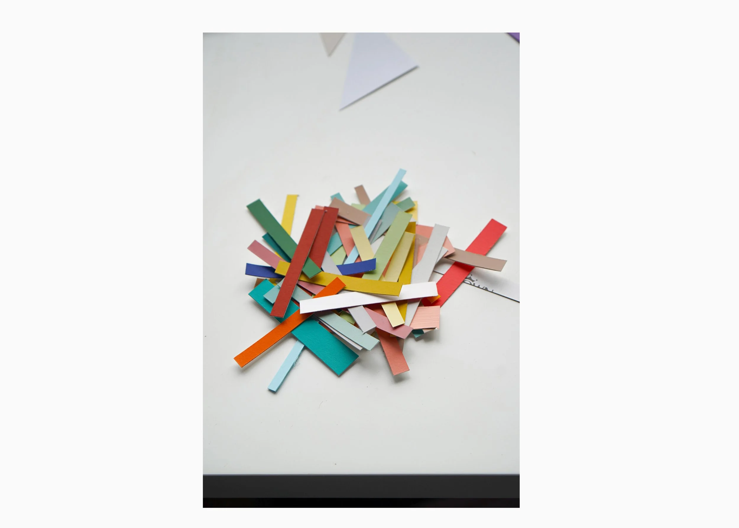
Colour of Saying, Colour & Material Research Studio
Photograph by Zeynep Sagir
Do seasons have a fixed colour palette or does it change and how?
Yes depends on what aspect your referring too. The seasons do have already assigned colour territories, warmth and coolness and there are theories for different seasons. However I research more around what's actually in the mind's eye or what we can perceive in nature during seasonal changes and shifts. Often looking at the seasonal behaviour or plants and botanicals and places to create a unique response to colour.
Can a colour evolve over time, carrying a different feeling as it changes shade or intensity?