Wiktoria Markiewicz is a Polish designer based in the Netherlands. She studied Interior Architecture and Furniture Design at the Royal Academy of Art in The Hague and is now the principal designer of Dot Objects. She produces furniture pieces that pay very close attention to the interaction of colour with materials and light. These furniture pieces are highly personalizable and their use of colour directly influences their use in the home and interaction with other interior elements. On the use of colour in her work, Wiktoria discussed the following:
‘To me, colour carries a sense of personality, reflection and memory. It can remind us of things we love: blue like the ocean or the sky, green like a grandmother’s garden, pink like a favourite summer dress. Colour has the ability to hold emotions and personal associations and it makes me incredibly happy when I can offer that small glimpse of personalization to others, especially as we often live in a reality that can feel quite grey and heavy at times. I remember one of my homes in Poland, where I asked for all bedroom walls to be lilac. I have always dressed in a lot of black and more muted tones, yet my interiors reflect my deeper needs and desires, often becoming more pastel, expressive, or contrasting. This is where I find a sense of safety and where my ability to design naturally becomes an act of curation. I founded Dot Objects in 2024, inspired by the quality time spent with my father, crafting and experimenting with materials together. Getting a helping hand or advice from him often means having to justify my colour choices, as different generations tend to idealize different aesthetics and styles. Yet some colours simply feel right without the need for explanation. There is an instinctive connection we have with certain tones and that emotional response is something I find fascinating within the design process.’
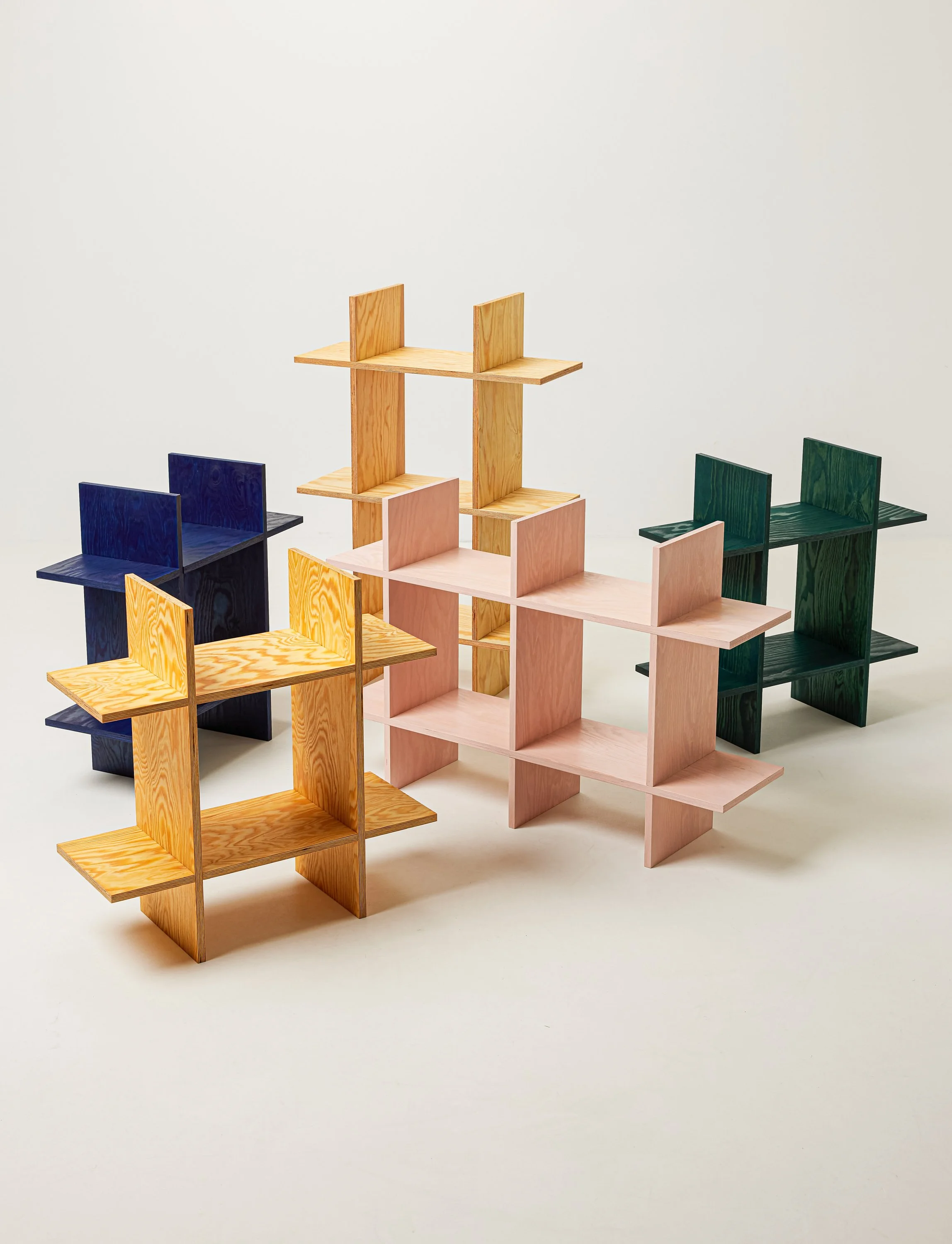
The Pine Grid Shelves
Image Credit: Dot Objects
I was initially drawn to the pine grid shelves that you produce, particularly due to the range of colors that they are stained. Can you describe the process of staining the wood for the shelves? The pigments used for the shelves are interesting. How did you settle on the four main variations of color used for the pine grid shelves? Was the decision driven more by established consumer preference or your taste and the settings that you envision these pieces to be used in?
Interesting that you ask that instead of assuming, as many people do, that it is solely determined by customer preference. I must admit that I am a little selfish when choosing the ‘default’ colourways of my products. In the case of the wooden objects, I tried to curate a selection that was not only aesthetically pleasing or composed of personal favourites, but also informed by the way different oils interact with the grain of the wood. Which ones reveal and accentuate its structure through contrast and which ones merge more subtly with the material, allowing its character to emerge without excessive emphasis on detail. Through this, I hoped to build a strong representation of what this particular method of working with pine wood and pigmented linseed oils can offer. When it comes to the yellow one, which is now the bestseller, it was actually a happy accident. During my collaboration with @well.homed, they specifically requested it and the radiant yellow unexpectedly became everyone’s happy place.
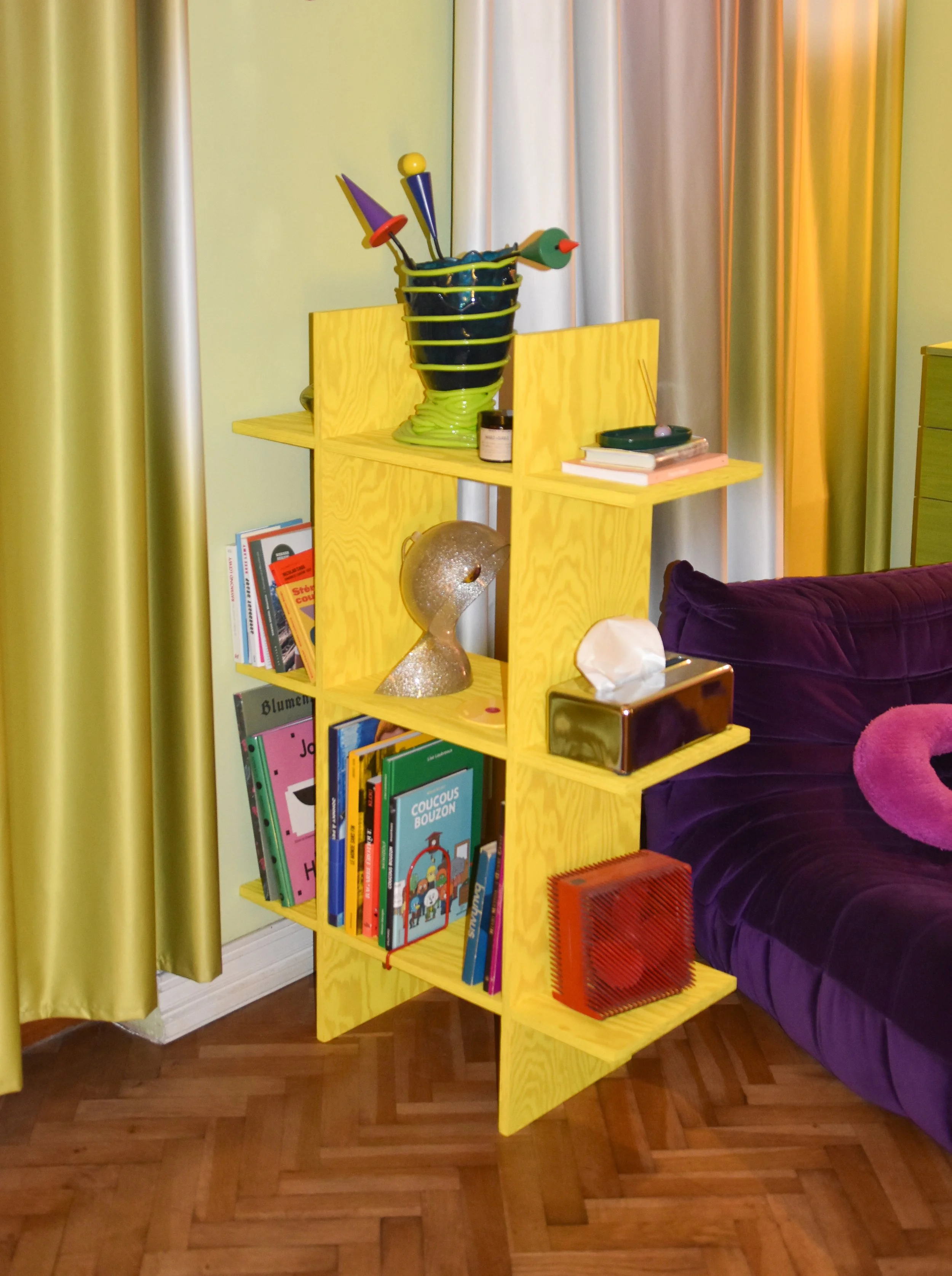
The Pine Grid Shelve
Image Credit: @well.homed
Can you give some details on some of the custom product orders that you have completed and the way that clients envisioned your products as interacting with the colour already present in their homes?
The least fulfilling thing about this process is that very often you never get to see the finished object in context. While clients may ask for custom dimensions or colours, it is rarely mentioned where or how the piece will ultimately serve within a space. I’m an interior designer after all, so I always try to ask questions and offer advice on space-efficient or more creative possibilities, especially since the grid system can expand and evolve in countless ways. The project I’m still waiting for is one that mixes different coloured planks together, creating a kind of totem of colour. The pieces I do get to see realized, however, often surprise me most through the way people choose to style them. There is something incredibly tender about seeing which objects people decide to display and share with others, what they hold close to their hearts: their holiday artefacts, photographs of loved ones, favourite books and other meaningful belongings. Through a single still image, you get a glimpse into the lives of others and begin to understand the personal narratives that surround the shelf you made. A true collaboration.
Is there any particular historical design movement or artist that you draw a lot of inspiration from when designing your work? I am interested in how your work and its use of colour relate to historical arts and design concentrations on colour.
I must say, I never clearly defined this for myself. While receiving my education at art school, it could sometimes feel intimidating to realize the vast amount of work that had already been created before me. The beautiful and extensive history of art and design made me question whether my own ideas were enough and whether originality is still possible when my personal style is not necessarily avant-garde. For a long time, I questioned the potential and desirability of what I wanted to create, as it is, of course, not about reinventing the wheel. I started creating before defining. Working with raw materials and highlighting their inherent beauty and qualities is the main goal. I would say that brutalism, modernism and neoplasticism resonate with me the most and elements of these movements can be found throughout my work.
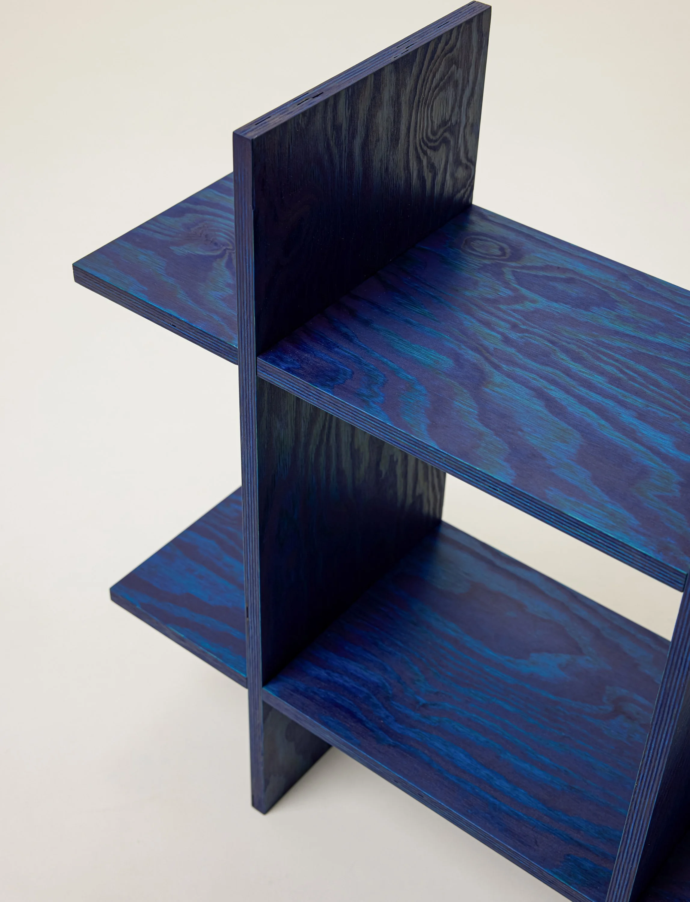
The Pine Grid Shelve
Image Credit: Dot Objects
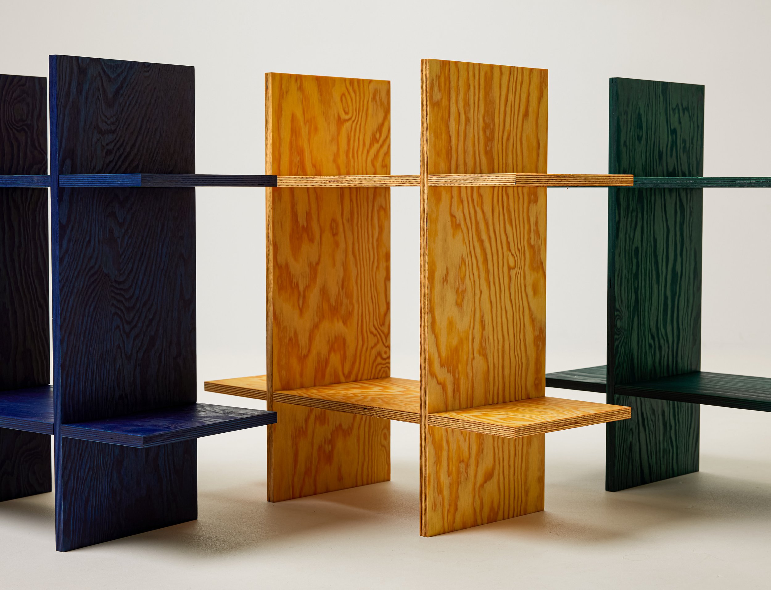
The Pine Grid Shelves
Image Credit: Dot Objects
Dot Objects @dotobjects.store