Children's View of Colour
Children's view of colour is a fascinating subject that has preoccupied different adult professionals from cognitive scientists to philosophers and art theorists. Why does children's artwork have such freedom of expression? Is it possible to have such a freedom of expression in adult work and how can we activate it? This article explores the child’s view of colour as observed by adults - specifically artists and theorists who watched children with curiosity, a desire to learn and a touch of envy for a "pure" (or rather “colourful”) state of mind adults cannot replicate. I draw on philosophers approaching this from different angles, notably Walter Benjamin’s lesser-known early writings that examine colour, children's behaviour and observations of his own son. His project parallels the ideas of Vasily Kandinsky and Paul Klee (Fig.1). I also look at Roland Barthes, who uses semiotics to view reality as a combination of signs, accessing the child’s perspective by analysing Cy Twombly’s intentionally "childish" yet powerful artwork in The Responsibility of Forms.
In art history, the reformulation of colour as an unbound, transcendental substance is most vividly manifested in abstract art. Seeking to create a less institutionalized, more accessible visual language, avant-garde pioneers looked outside the Western European canon, drawing inspiration from non-Western art and children's drawings. Vasily Kandinsky included children’s drawings alongside established art in The Blue Rider’s Almanac (1912) to illustrate a mindset freed from traditional formal constraints. His writings position children's colour perception as a source of inspiration, and his 1910s artwork explicitly explores the separation of colour and form often seen in children’s drawings. Following this long-standing tradition of dialogue, this article pairs famous artworks that adopt a child-like lens with pieces created by real children. To that end, I am deeply grateful to Matvei Barskov, Luka Barskov and Sofia Pustovitova (aged 8, 6 and 7), as well as my artist and art historian friend Elena Sakovskaya for generously providing their artwork.

Paul Klee, Angelus Novus, 1920, monotype, watercolour and ink on paper
Image Credit: Wikimedia Commons
Walter Benjamin owned this painting and was inspired by it in his philosophical essay “On the Concept of History” (1940), where he describes it as the “Angel of History” - a child-like figure that looks at the past while being relentlessly pushed into the future.
One of Walter Benjamin’s goals was to challenge the canon envisioned in Immanuel Kant’s The Critique of Judgment (1790), which asserts the superiority of form over colour, claiming, ‘The design is what is essential [...] the colours, which give brilliance to the sketch, are part of the charm.’ For Kant, colour has a purely decorative function that can ‘enliven the object for sensation, but make it really worth looking at and beautiful they cannot.’ As David Batchelor summarizes in Chromophobia (2000) ‘for Kant, colour could never participate in the grand schemes of Beautiful or Sublime; it was merely "agreeable," adding "charm" without bearing on aesthetic judgment’. However, this longstanding view shifted radically at the turn of the 20th century, when artists refocused on colour as the driving force of painting.
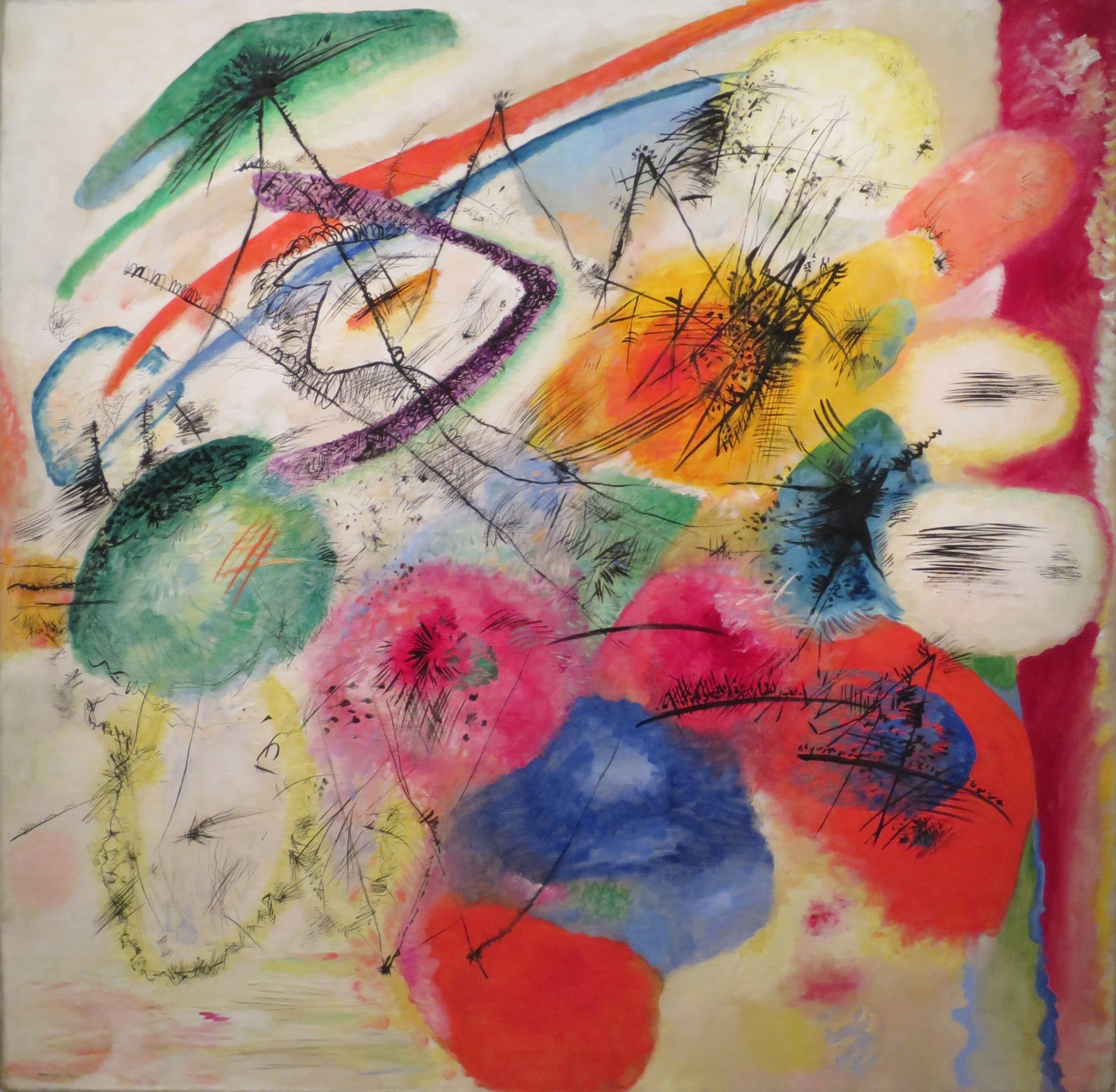
Vasily Kandinsky, Black Lines, 1913, oil on canvas
Image Credit: Wikimedia Commons
How did avant-garde artists create this new mode of colour? The rise of abstraction and formlessness allowed them to minimize shape, positioning colour as the driving force capable of establishing direct contact with the viewer. Vasily Kandinsky’s 1910s works—such as First Abstract Watercolour (1911), Improvisation 31 (Sea Battle) (1913), and Black Lines (1913) (Fig. 2) - strived for a ‘relative absence of linear elements’, allowing colour to exist in a free, transparent and unshaped mode. The colour fields there evoke Barry Schwabsky’s commentary on the nature of a blush: ‘Is a blush something we see on someone's face or in it? The face is marked by it, though it is not a sign on the face like a tattoo.’ Kandinsky’s colour spots act as similar marks - reminiscent of a child painting round red circles over a figure’s cheeks. Here, colour is entirely liberated from shape; it floats dynamically in space.

Luka Batskov, Vase with Flowers and Fruits, 2026, pencil and marker on paper
Image shared with permission by the child and their family
Luka's still lifes create a charming, non-dimentional world in which objects are connected by colour and pattern instead of spatial arrangement.
What exactly makes children’s art so inspirational for adult artists? According to Walter Benjamin, children perceive colour as fluid, unbound and disconnected from shape or space. It is "isolated" from other properties, because ‘their eyes are not concerned with three-dimensionality’ and because depth is experienced through touch instead (Fig. 3). Cognitive science backs up this intuition, demonstrating that colour dominance declines as children age. Pitchford and Mullen’s study, "The Developmental Acquisition of Basic Colour Terms" (2006), found that while three-year-olds favour colour over other attributes - making 55% of their visual matches based on colour compared to just 26% for shape - a dramatic shift occurs by age four. For children aged four and above, shape becomes the dominant attribute at 90% of matches, while colour drops to just 7%. This proves that while children learn to prioritize shape as they grow, they are initially moved primarily by colour. This scientific reality resonates with Benjamin's observation that initially ‘children's drawings take colourfulness as their point of departure,’ seeking colour in its greatest transparency with ‘no reference to form, area, or concentration into a single space.’
In his essay Painting and the Graphic Arts, or Signs and Marks (1917) Walter Benjamin examines the relationship between colour, line and surface. He argues that beyond the initial compositional layout, nothing inherently binds colour and line together. To Benjamin, compositional colour segments exist independently of drawing, noting that ‘the only instance in which colour and line coincide is in the watercolour, in which the pencil outlines are visible and the paint is put on transparently.’ This view reflects an interesting phenomenon I find in children’s drawings - the disengagement of drawn outlines from colour spots. While children willingly or not seek to transfer coloured forms to their paintings to fit a prescribed subject, their drawings allow for the free co-existence of all elements.
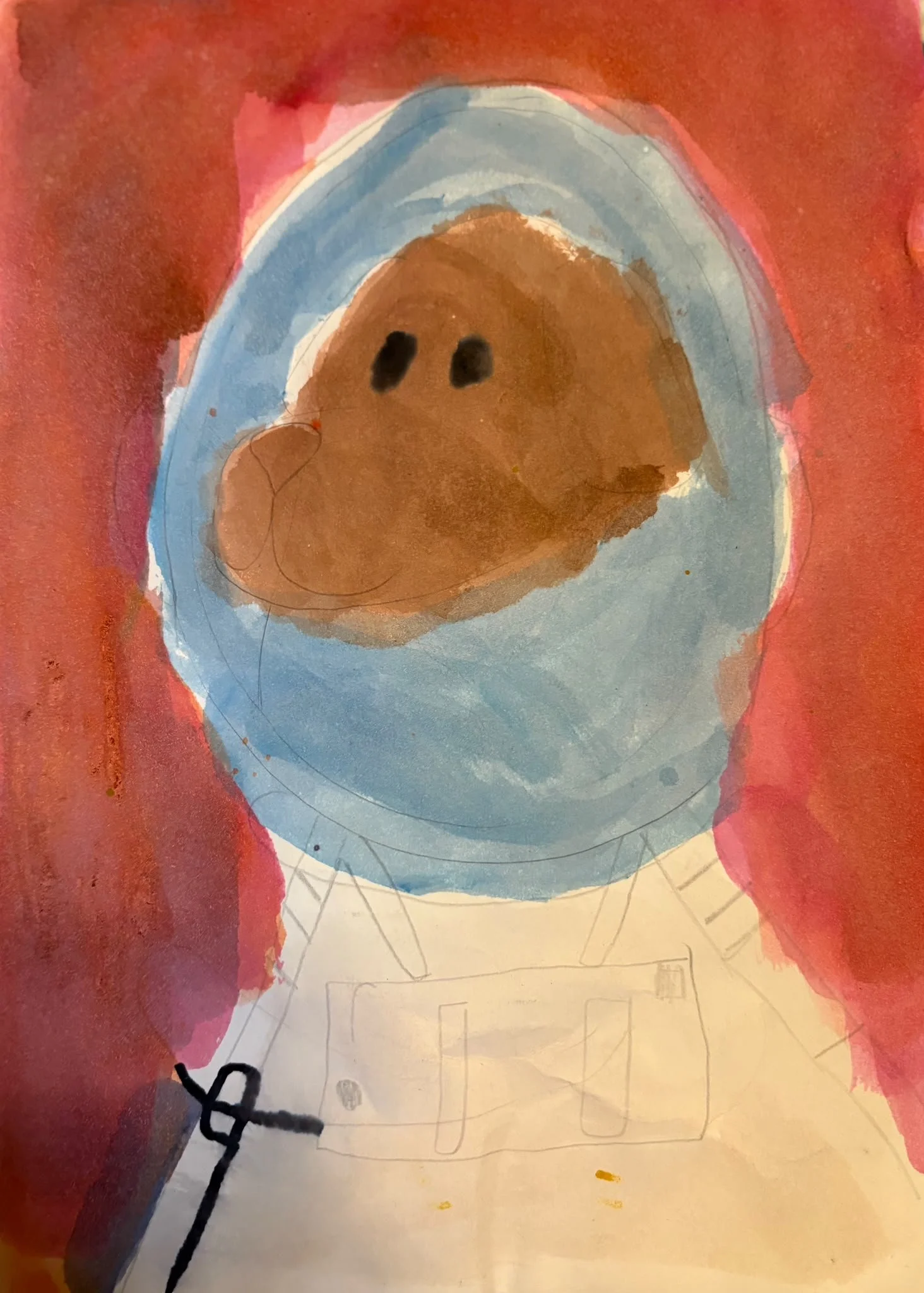
Matvei Barskov, Cosmonaut, 2026, watercolour on paper
Image shared with permission by the child and their family
As an illustration, I put here a watercolour by Matvei, titled Cosmonaut (Fig. 4). The painting can well be read as an abstraction, but the pencil lines underneath colour strokes give out the figure of a cosmonaut with features of a teddy bear. The layers co-exist freely - the colour does not sit tight within the boundaries, but the composition of lines adds a different layer of meaning. The eyes here are central to the composition, uniting colour strokes and lines together. They are also very powerful: despite being schematic, having no volume and detailing, they are very human and warm.
Seeking to defy the Kantian formula, Benjamin uses the rainbow to illustrate a natural phenomenon that is ‘only colour’ (‘nothing in [rainbow] is form’). In his essay A Dialogue on the Rainbow (1915) he suggests that colour is not a boundary to form, but form itself: ‘The rainbow is a pure childlike image. In it colour is wholly contour; for the person who sees with a child's eyes, it marks boundaries’, ‘it is not a layer of something superimposed on matter, as it is for adults.’ As Barry Schwabsky interprets it, adults habitually disregard the world's essential colourfulness because they see it as ‘irrelevant to the object-quality of its contents, intuited by way of the Kantian categories.’
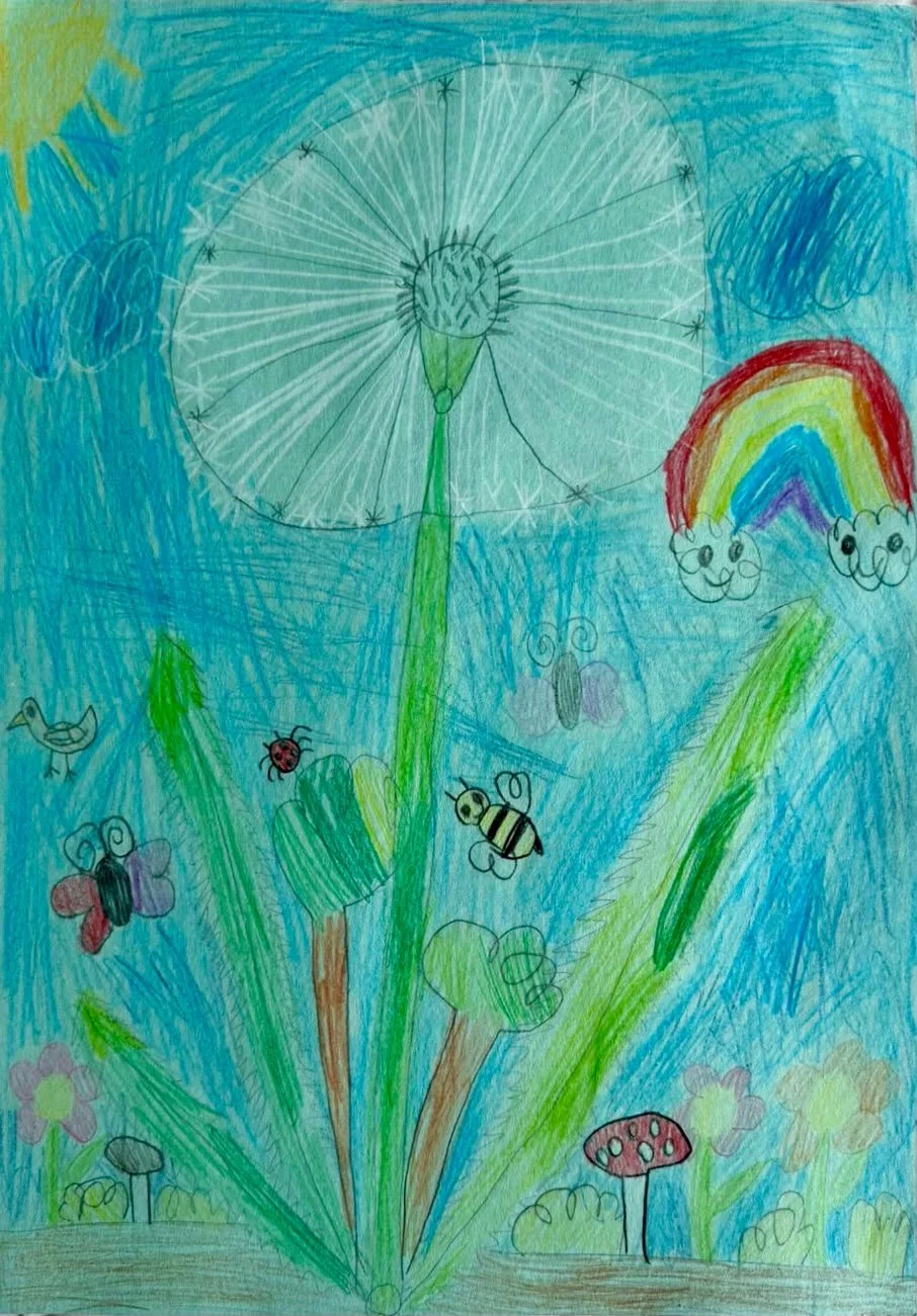
Sofia Pustovitova, Dandelion, 2026, pencil on paper
Image shared with permission by the child and their family
This exact phenomenon - where colour operates as its own boundary rather than a layer superimposed on form - is apparent in Sofia’s drawing Dandelion (2026) (Fig. 5). Her work constructs a vibrant universe of flowers, butterflies and birds, reflecting a deep fascination with natural elements, which, as Theodor Adorno suggested, possess an inherent aesthetic beauty distinct from society. A central dandelion appears both fundamental and fragile, its delicate white lines capturing the soft, tactile quality of a plant subject to metamorphosis. However, the definitive accent of the piece is the rainbow itself. Unlike the drawing's other objects, the rainbow lacks rigid, separating contours; instead, the coloured pencils define their own boundaries. The materiality of the colour navigates the form, directly embodying Benjamin's assertion that for the child's eye, colour ‘is wholly contour’. Sofia’s gradient handling demonstrates that because children are unconcerned with strict adult mimetism, they can rely on intuitive colour blocking to portray a rainbow's true, expansive essence.
As much as colour is unbound to form, it is also unburdened by temporal and spatial relationships. Walter Benjamin emphasizes that, ‘a child’s experience of colour is purely receptive, operating without the imposition of schematic categories of time and space.’ This suspended cognition is mirrored in Cy Twombly’s work, where Roland Barthes notes that the gesture is inscribed directly onto the surface as a sensual, incomplete trace: ‘Twombly's line is not a line but a tracing, a trail, a spoor; it is the body, writing.’ This writerly approach to art links directly to the semiotics of Stéphane Mallarmé’s poem Hérodiade, where autonomous colour-signifiers like the "red shudder" of blood function exactly like Twombly's gestural "spoor." In both mediums, colour and mark-making are stripped of their traditional communicative burdens; they cease to be passive attributes of an object and instead become primary signifiers where the material itself constitutes the meaning. We see this exact semiotic exploration of affect over cognition across Twombly’s varied artworks: the erratic, dripping, blood-red wax-crayon loops of Bacchus (2005), the violently scratched, literary-infused surfaces of Quattro Stagioni (1993-95), and the urgent, crimson ruptures of Lepanto (2001). In each, colour operates entirely outside of a schematic grid, serving as an active, visceral process of material exploration.
What I find equally intriguing in Cy Twombly’s work is the free relationship between the graphic elements and the background. This space can be vacuum-like as well as airy, but it doesn’t constrain the elements to be precisely positioned or strictly arranged. There is an expressiveness of the stroke that exists outside of temporal boundaries, and as Barthes formulates it: ‘one might say that there is never anything but the memory or the anticipation of the stroke: on the paper – on account of the paper - the tense is perpetually uncertain.’ As my friend, artist and art theorist Ekaterina Belukhina, once put it, Twombly’s work is striking because ‘despite seeming to do so little, he creates such an interesting space,’ (reminding me that in art, less can indeed be more). Not only do all the marks and signs work together in the here and now, but the empty background he leaves also lives its own life. Because Barthes connects Twombly’s art to writing, reading this empty space is like reading between the lines of a text - to read what wasn’t spelled out.
Luka Barskov, Stranger on the Bridge, 2026, watercolour on paper
Image shared with permission by the child and their family
We can see this active background dynamic in Luka’s painting, Stranger on the Bridge (2026) (Fig.6). I love how the figures here are schematized and approximated - the sun becomes an abstract shape, a symbol rather than a direct representation. A similar process happens with the bridge, portrayed with a single, unfinished stroke of blue on green. The unconstrained existence of these elements defies gravity, calling to mind objects floating in space through a child-like imagination that transcends physical laws, allowing the man to walk between bodies of light instead of treading the ground. By a similar logic, the background does the opposite of what is expected; instead of being secondary, it takes over the figures, enveloping them in its own abstract pattern. Here, black is not really black, but contains nuances from light grey to chocolate and charcoal, suggesting that nothing is literally "black and white" and that there are shades to every event.
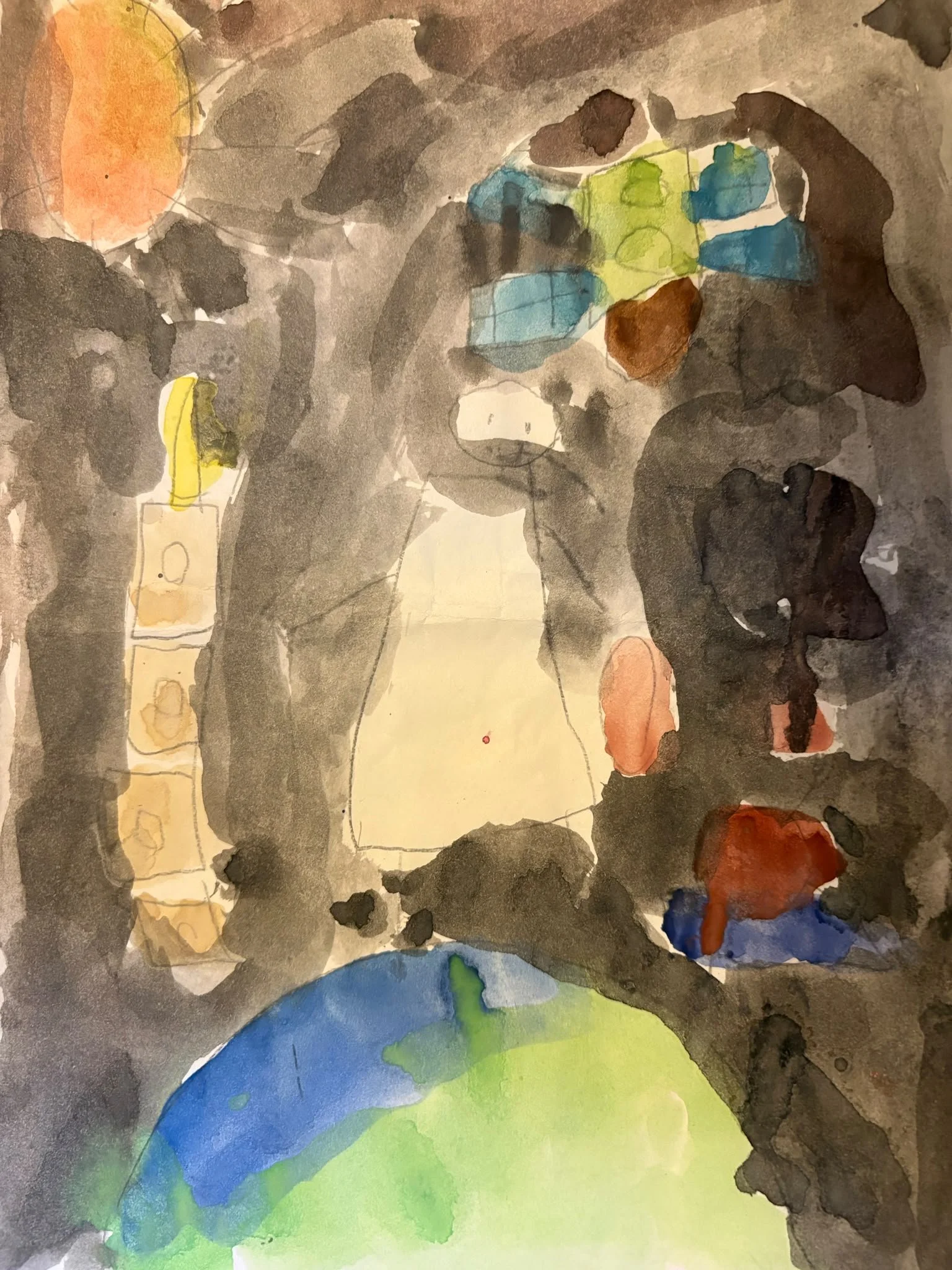
I want to highlight similar spatio-temporal effects in Matvei’s drawing, Goblet of Fire (2026) The grouping of elements on opposing sides reminds me of Twombly’s use of signs, symbols and narrative space. Matvei leaves a vast blank between the two groups of figures, creating a tension that signals both spatial and psychological distance, yet simultaneous interconnectedness between Harry Potter and his opponents. The space between figures is dense despite its emptiness. The time is uncertain: the schematic strokes of red and green, symbolising the light of spells, indicate that the fight happens in the here and now, yet possesses a felt duration. Perhaps the drawing's intensity stems from its source of inspiration the original story, which speaks, between the lines, of the dual nature of good and evil: Harry and his nemesis are interconnected to the point where separating their identities becomes difficult. Nevertheless, it takes true discernment to capture the essence of this fundamental conflict and translate it into a personal, chronicle-like homage like Matvei did in his drawing.
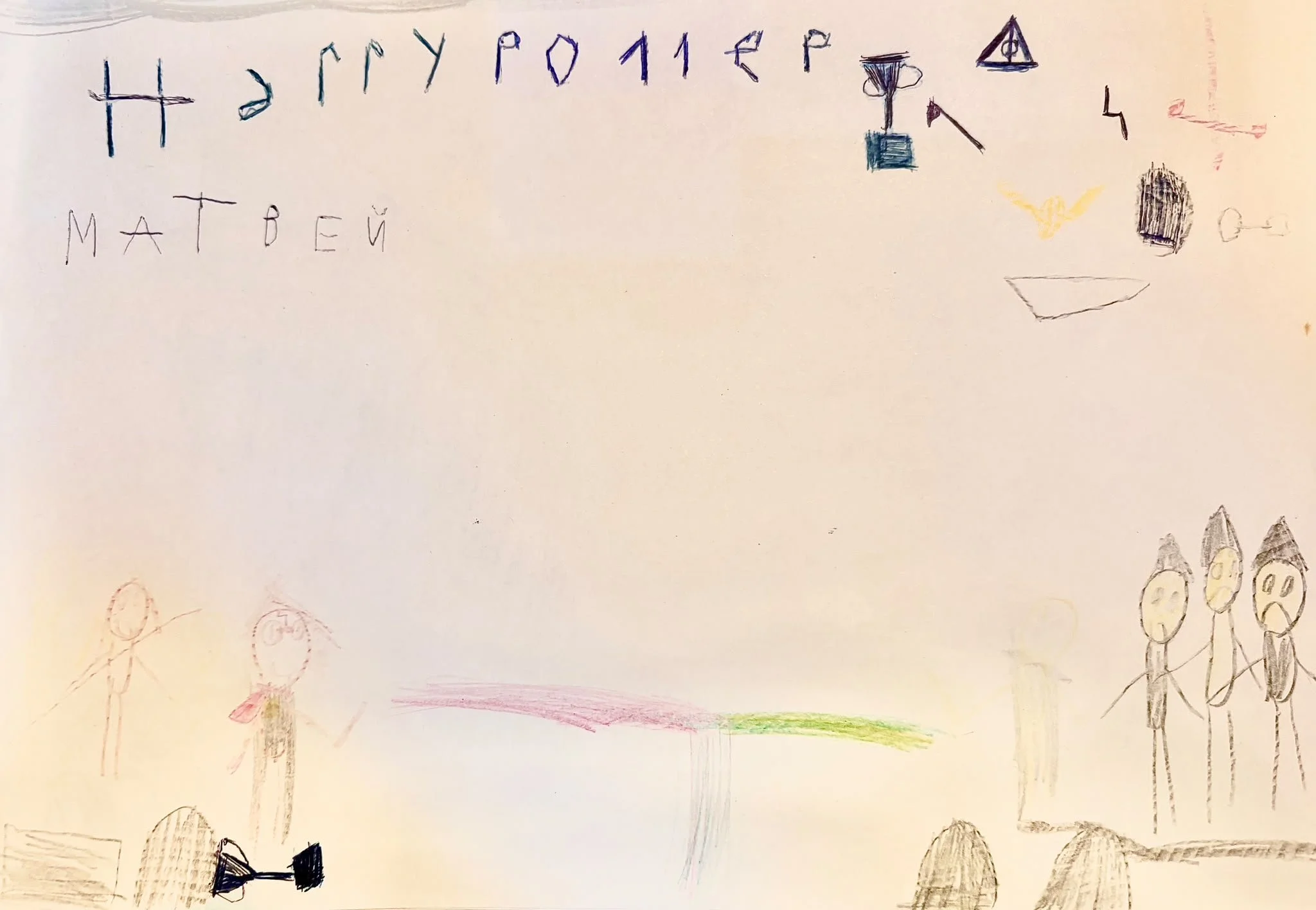
Matvei Barskov, Goblet of Fire, 2026, pencil on paper
Image shared with permission by the child and their family
So far, we have discussed how children view colour as unconstrained by form, time, and space. However, one constraining factor that may not be so easy to overcome is language. While language is a fundamental part of identity, it is also the medium through which we acquire social and cultural restrictions. In Pitchford and Mullen's study, "Is the acquisition of basic-colour terms in young children constrained?" (2002), an experiment demonstrated that young children usually learn the names of "primary colours" faster than non-primary colours, with brown and grey typically being the last acquired. They found that ‘a significant correlation was found between children’s preference and naming of the 11 basic colours, indicating that within the same children, the colours that are least likely to be named accurately are those that are least preferred.’ The way we learn to name things is bound to our affections.
This language correlation demonstrates the influence of school and home environments. Early conceptual development of colour may be affected by ‘other environmental or cultural factors,’ such as maternal input. In a 2005 paper, Pitchford and Mullen demonstrated that of the 11 basic colour terms, brown and grey appeared significantly less often in both preschool texts and mothers’ speech. Their study showed that word frequency counts correlated significantly with colour preference and colour naming, suggesting that children are more likely to prefer and name the colours that mothers use when interacting with them. This linguistic mapping links directly back to Barry Schwabsky’s thought on ‘the classic topos of the one and the many’:
‘...my experience is of a multiplicity of different colours, yet all these different, distinguishable and sometimes clashing colours point me back to a kind of unity of colour, what I might even call the fundamental colouredness of the world. Colour exists as an unbroken continuum, but the language that directs our perception breaks this continuum down into distinct areas that are red, orange, yellow, green, and so on.’
This ordering, systematization and fragmentation of colour performed by language is what abstract art seeks to undo by defying Kantian formulas. This defiance creates a radical break between the subject and the object, manifesting a different mode of "chromatic" existence in which a person is immersed in colour unconditionally. For Benjamin, languages communicate themselves and ‘have no speaker if this means someone who communicates through these languages.’ This configuration separates the speaker from the spoken as much as viewer from the viewed, thus removing the artist from "using the colour" and the viewer from "viewing of the colour." Through colour, one can perceive the "non-dimensional character of the relation between infinity and object." Benjamin demonstrates this in his essay Dialogues (1914–1921), where the artist Margarete finds herself not ‘using the colour as a means of perception,’ but instead completely ‘dissolved in the experience of colour’.
This dissolution brings us back to the true nature of language: it is not just a passive tool for transferring external thoughts, but a medium that creates meaning within itself. Just as language breaks down the boundaries between the subject (the observer) and the object (the observed), Walter Benjamin suggests that in children's art, colour operates as ‘the medium of all changes and not a symptom.’ A medium, by definition, is something that mediates and immerses. We see this in Jacques Lacan’s view of language as an autonomous system, as well as in Howard Caygill’s reading of Benjamin’s work on translation, which he views as a form of rewriting that actively changes meaning for the recipient. This concept perfectly mirrors how the artist's identity dissolves in abstract art. It recalls Paul Klee’s 1914 diary entry from his trip to Tunisia: ‘Colour and I are one.’ Instead of standing outside the medium and looking in, creators completely lose their sense of being separate entities. Ultimately, colour stops being a mere tool for making art; it becomes an autonomous language, communicating entirely in and through itself.
Another experience Benjamin appraises is that of “youth”, detailed in his Experience essay (1913), where he connects it to a spirit (‘Geist’) of vitality, creativity and openness. Kandinsky similarly pointed to an ‘inner call’ as the artist's driving force. Benjamin found a parallel in the child’s view of colour, noting that it reflects a ‘child’s pure receptivity’ and provides "an implicit instruction to a life of the spirit.’ In the child's imagination, colour moves directly from the spirit, freed from representation. Appealing to adults to encourage this directness, Benjamin wrote:
‘…Wherever [colour] is not confined to illustrating objects, it must be full of light and shade, full of movement, arbitrary and always beautiful. In this respect, colouring-in has a purer pedagogical function than painting, so long as it makes transparent and fresh surfaces, rather than rendering the blotchy skin of things.’ (“Aphorisms on Imagination and Colour”, 1914-1915)
By framing colouring-in this way, Benjamin suggests using initial outlines merely as a starting point for imaginative thinking, prioritizing it over mimetic reproduction, which he believed blocks exploration.
This freedom of exploration is an essential mindset that adults, particularly artists, often struggle to retain. Both Benjamin and Kandinsky expressed concerns about how institutional education conditions creativity. In On the Question of Form (1912), Kandinsky criticized formal academic training, arguing that ‘the academy is the surest way of destroying the power of the child, causing average talents to learn practical meanings while losing the ability to hear their inner sound, producing a "correct" drawing that is dead.’ Benjamin shares this sentiment in A Child’s View of Color (1914-1915), noting that children naturally perceive colour free from form, but ‘have to be disciplined to colour within the lines.’ By learning to restrict colour to shape, children gradually overwrite their instinctive perception to conform to adult standards. This shift mirrors Benjamin's broader reflections in Experience (1913), where he observes that what adults call "experience" is often just resignation and conformity - a form of "spiritlessness" which is take for “wisdom”. When we grow up, our perception of colour becomes strictly functional; it serves to alert, inform, or categorize objects, causing us to lose the vibrant, emotional resonances with the colour and the world.
In the end, we face the problem formulated best by Picasso: ‘every child is an artist. The problem is how to remain an artist once he grows up.’ Of course, modern educational techniques have significantly evolved since Benjamin and Kandinsky expressed their concerns: contemporary schooling and parenting increasingly prioritize creativity, while widespread psychological practices encourage "contacting one's inner child." Yet, breaking out of a regulated, unemotional existence into an affective, “colourful” way of living still requires a fundamental shift in perspective.

Paul Klee, Movement around a Child, 1930, oil transfer and watercolour on paper
Image Credit: Saint Louis Art Museum - Public Domain
For children, this shift occurs naturally through play - a near - permanent state that allows for an unprejudiced view of the world. Benjamin recognized this, viewing the child's capacity for play as a revolutionary force. Developing similar ideas in The Responsibility of Forms (1985), Roland Barthes quotes the British psychoanalyst D.W. Winnicott who suggested that ‘it is a mistake to reduce a child’s play to pure ludic activity," reminding us of the crucial opposition between “game” (regulated activity) and “play” (which has no rules). He notes that ‘the child’s – and artist’s – reality is the process of manipulation, not the object produced.’ This emphasis on raw process over a finalised product echoes Benjamin's praise for improvisation-driven Russian avant-garde children's theatre, where value lied primarily in an unconstrained experiment and teachers’ guidance was minimal.
Play is an invitation to assume different points of view. Through this free manipulation of objects, props and colours, children learn about themselves and the world, using play to inhabit positions different from their own. Artists engaged in this open-minded mode of creation are far more likely to innovate. Sometimes, a change of perspective occurs through a literal change of physical position. A case in point is the anecdote about Kandinsky’s discovery of abstract art: upon returning to his studio at dusk, he saw one of his paintings leaning on its side, illuminated by the setting sun. Unable to recognize the subject matter, the picture appeared purely as a beautiful arrangement of colours and forms; convincing him that realistic representation was not essential. I experienced a similar revelation when a Cosmonaut (2025) drawing first appeared to me upside down, allowing me to appreciate how the colours there lived an entirely independent life.
Similarly, in his essay Painting and Graphic Arts (1917), Walter Benjamin argued that certain art should be viewed vertically, and others horizontally:
‘We might say that there are two sections through the substance of the world: the longitudinal section of painting and the cross-section of certain pieces of graphic art. The longitudinal section seems representational; it somehow contains the objects. The cross-section seems symbolic; it contains signs.’
To him, viewing children's drawings vertically often conflicts with their inner meaning. Benjamin concludes this short piece with a remark on Kandinsky's pictures, which are ‘the simultaneous occurrence of conjuring and manifestation,’ meaning that we see the process rather than the result. The same applies to children's paintings; since most children draw horizontally, it makes sense to read their work like maps laid out on a table - planes entirely filled with signs. Overall, I read Vasily Kandinsky’s and Walter Benjamin’s thoughts as a suggestion to engage in a play with one’s own art – be it through a physical dislocation of objects in space or by adopting a ‘play-like’ attitude to the process of creation.
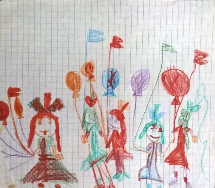
Elena Sakovskaya, 8th of March Parade, 1980, pencil on squared paper
Image courtesy of the artist
“I was three years old when my parents took me to my first-ever demonstration. I enjoyed the experience so much that I drew this picture as soon as we got home. I like that it features only women, capturing the essence of the celebration - International Women’s Day. What also strikes me now is that unlike most of my other childhood drawings I chose a horizontal format to convey the movement of the walking crowd.”
At other times, a shift in perspective comes from returning to where one began. Paul Klee experienced a moment of revelation when, after finishing the art academy in Rome, he returned to his childhood home and found a pile of his early drawings in the garage. Realizing his academic paintings felt far less fresh and sincere, he wrote to his fiancée that these childhood drawings were his ‘most significant work until now.’ Klee later included eighteen of them in his catalogue, creating artworks in a ‘child's style’ (Fig.5) that entered into a nostalgic dialogue with his own childhood drawings. I read this episode as a suggestion that if one lacks a creative child to find inspiration in, returning to one's own childhood archive is a powerful alternative (Fig.6). Ultimately, drawing parallels between canonical masterpieces and children's art illuminates Charles Baudelaire’s claim in The Painter of Modern Life (1863) that ‘genius is nothing more nor less than childhood regained at will.’ It is precisely this state of eternal newness - looking at the world with a forever-surprised eye - that produces truly resonant works of art.
Bibliography
Batchelor, D. (2000) “Chromophobia”. London: Reaktion Books.
Barthes, R. (1985) “The Responsibility of Forms: Critical Essays on Music, Art, and Representation”. Translated by R. Howard. New York: Hill and Wang.
Benjamin, W. (1996) “Selected Writings, Volume 1: 1913–1926”. Edited by M. Bullock and M.W. Jennings. Cambridge, MA: Harvard University Press. Includes essays: “Experience”, “Metaphysics of Youth”, “Aphorisms on the Imagination of Colour”, “A Child’s View of Colour”, “Painting or Signs and Marks”, “Painting and the Graphic Arts”, “Perception is Reading”, “On Perception”, “Old Forgotten Children’s Books”, “A Glimpse into the World of Children’s Books”, “Program for a Proletarian Children’s Theater”, “Dialogues”, “The Rainbow of the Art of Paradise”.
Pitchford, N.J. and Mullen, K.T. (2002) ‘Is the acquisition of basic-colour terms in young children constrained?’, “Journal of Experimental Child Psychology”.
Pitchford, N.J. and Mullen, K.T. (2005) ‘The role of perception, language, and preference in the developmental acquisition of basic colour terms’, “Journal of Experimental Child Psychology”.
Pitchford, N.J. and Mullen, K.T. (2006) ‘The developmental acquisition of basic colour terms’, “Journal of Experimental Child Psychology”.
Schwabsky, B. (2010) ‘A Benjaminian View of Colour’, “Tate Etc.”, Issue 19 (Summer). Available at: [https://www.tate.org.uk/tate-etc/issue-19-summer-2010/through-eyes-child](https://www.tate.org.uk/tate-etc/issue-19-summer-2010/through-eyes-child ) (Accessed: 14 June 2026).
List of Figures
Fig. 1. Paul Klee, Angelus Novus, 1920. Monotype, watercolour and ink on paper, 31.8 × 24.2 cm. Wikimedia Commons
Fig. 2. Vasily Kandinsky, Black Lines, 1913. Oil on canvas, 129.4 × 129 cm. Wikimedia Commons
Fig. 3. Luka Barskov, Vase with Flowers and Fruits, 2026. Pencil and marker on paper, A4. Courtesy of the child and their family
Fig. 4. Matvei Barskov, Cosmonaut, 2026. Watercolour on paper, A4. Courtesy of the child and their family
Fig. 5. Sofia Pustovitova, Dandelion, 2026. Pencil on paper, A3. Courtesy of the child and their family
Fig. 6. Luka Barskov, Stranger on the Bridge, 2026. Watercolour on paper, A4. Courtesy of the child and their family
Fig. 7. Matvei Barskov, Goblet of Fire, 2026. Pencil on paper. Courtesy of the child and their family
Fig. 8. Paul Klee, Movement around a Child, 1930. Oil and watercolour on jute, mounted on cardboard, 38.1 × 53.2 cm. Saint Louis Art Museum
Fig. 9. Elena Sakovskaya, 8th of March Parade, 1980. Pencil on squared paper. Courtesy of the artist