In Pursuit of Colour Part One: Yellow Ochre
The geography of colour is a concept developed by Jean-Philippe Lenclos, a French designer-colourist. Through his work he "deduced that each geographic region engendered in its inhabitants a particular taste for the colours they made for their housing, and formed part of their identity".
Although his work focuses on the use of colour in the design of the built environment, it touches on something profound: that the colours we see and experience every day through landscape and environment unconsciously seep into us and form part of our identity. Could it therefore follow that paintings or artworks created from found or foraged colours significant to the artist or subject would capture something that mass-produced colours cannot?
Inspired by this thought, I am on a mission of sorts: to collect and create a library of pigments with which to make paint. The aim is for the pigments to act as a way of exploring genius loci, the distinctive character and atmosphere of a place which is created in part through colour geography and can impact the subject of a work through the collection of pigments. These pigments must therefore come from places that, through repeated exposure or family connection, are significant to me and/or the subjects of my work.
To have a usable palette of colours for portraits, I need, as a minimum, to collect the Zorn palette, attributed to the Swedish artist Anders Zorn and also known as the restricted palette. It is made up of white, black, yellow and red. This restricted palette is typically used for portraits or figurative works rather than landscapes. This limited approach is not only useful in that it requires a disciplined approach to mixing colours and considering their relationships within a painting, but it also feels achievable as a first goal in the creation of my pigment library. As well as collecting enough pigments to create the desired palette, the other primary challenge is that the pigments must be usable. This means that they must be mixable with an appropriate binder, which for me is either oil or egg yolk to create tempera.
The yellow in the Zorn palette is typically yellow ochre. Ochres are ancient pigments and among the very first to be used by humans. They are present in the oldest known human artworks, with the oldest currently dated to 67,800 years ago.

Cave of Altamira and Paleolithic Cave Art of Northern Spain. It is considered a unique artistic illustration of this period, particularly of the Magdalenian culture.
Image credit: Wikimedia Commons
Ochres are clay pigments made up of an impure form of iron (ferric) oxide and varying amounts of clay and sand which can also be heated to produce other hues. Yellow ochre deposits are found throughout the world and have been used by diverse cultures throughout history. In the UK, goethite (iron oxide hydroxide) occurs widely in Oxfordshire and a pigment known as Oxford Ochre; a mixture of goethite and clay minerals, was once obtainable from the Shotover Hills near Headington. Limonite, another iron-based mineral (although not a true mineral), is also found in the east of England. It can be found in the strata of the Clay with Flints Formation, but unlike purer deposits of ochre, the yellow hue is seen as staining or as hard nodules within sandy clay deposits. Living in the south-east, digging some local ochre-containing clay seemed like a good starting point for producing a yellow pigment. Ochres, once prepared, produce stable and lightfast pigments which can be used in oil and tempera.
I have several books on historic art materials and processes. The Materials and Techniques of Medieval Painting contains a passage on the use of clays as pigments, warning:
“A small amount of colouring material will tinge clay strongly while it is damp, but will hardly show itself when the clay is dry… Ochres, to be good, must consist very largely of the coloured salts of iron and not, as most earths do, feebly coloured clay.”
Undeterred by this warning, I harvested a sample of clay from my garden which forms part of the extensive clay deposits that cover much of the bedrock of Essex, where I grew up and Hertfordshire, where I now live. The colour of this clay-rich earth has been a continuous part of my life and is so deeply ingrained in my memory that it would be a shame not to add it to my colour library, even if it does turn out to be feeble.
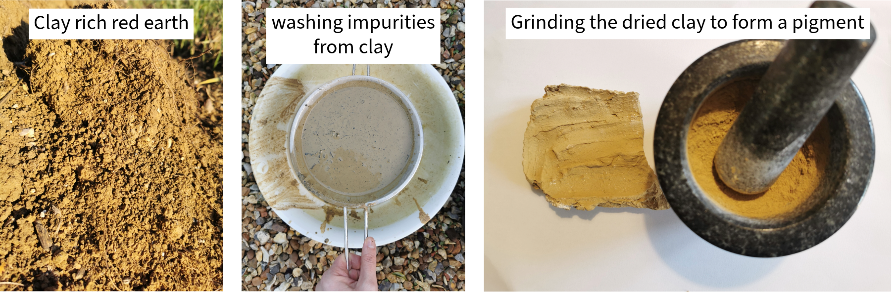
Clay harvesting and processing
Image credit: Charlotte Pratt
Concerned that the clay would yield a feeble pigment, I also searched the field margins on my regular walking routes for soft minerals that appeared to contain iron. I was pleasantly surprised to find several pieces that seemed suitable. To test the suitability of each sample, I performed a streak test. The streak is the colour of a mineral when it is finely powdered. This can easily be tested by scraping the mineral across the back of a white unglazed tile. The mark left on the tile is the streak. Following the streak test, I selected two samples to begin with. One was particularly richly coloured and left an orange streak; the other, a lighter sample, left a pale brown-orange streak.
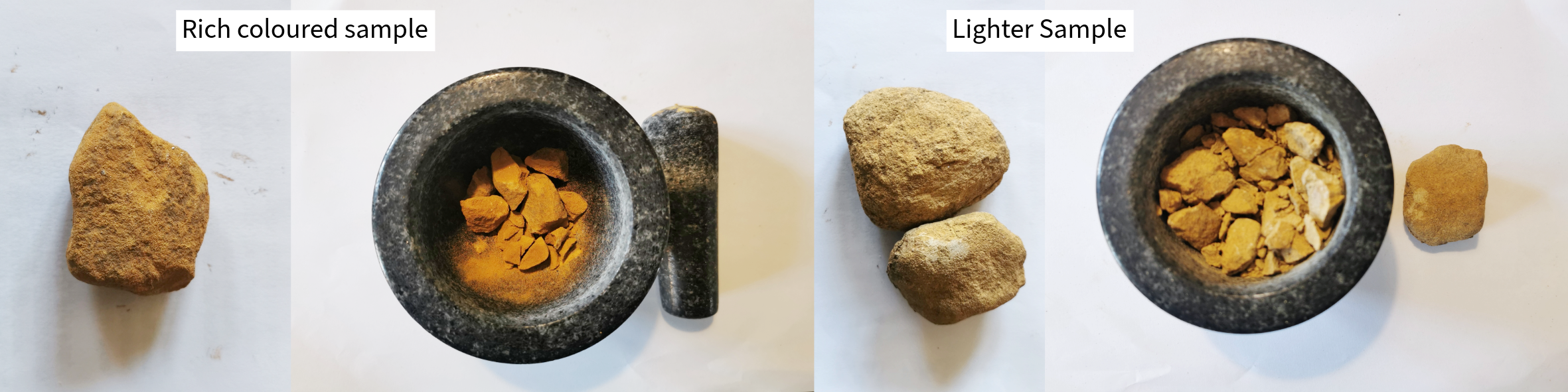
Mineral samples
Image credit: Charlotte Pratt
To create usable pigments, the samples need to be washed. Dirt and debris were removed from the surface with a stiff brush, after which the samples were crushed into a coarse powder using a pestle and mortar. Each crushed sample was placed in its own jar, which was then filled with water and stirred vigorously. This helps remove excess salts or unwanted contaminants. The process is repeated until there is no visible froth on the surface of the water.
Once dry, the samples were further prepared through levigation. The dry ground samples were placed in a jar with water and stirred thoroughly, ensuring all particles were wetted. The mixture was then allowed to sit for a few minutes. Due to gravity, heavier, coarser particles sank to the bottom, while finer particles remained suspended (or levitated) in the water. The water containing the fine particles was carefully poured off, or removed with a syringe or pipette and collected in a separate container.
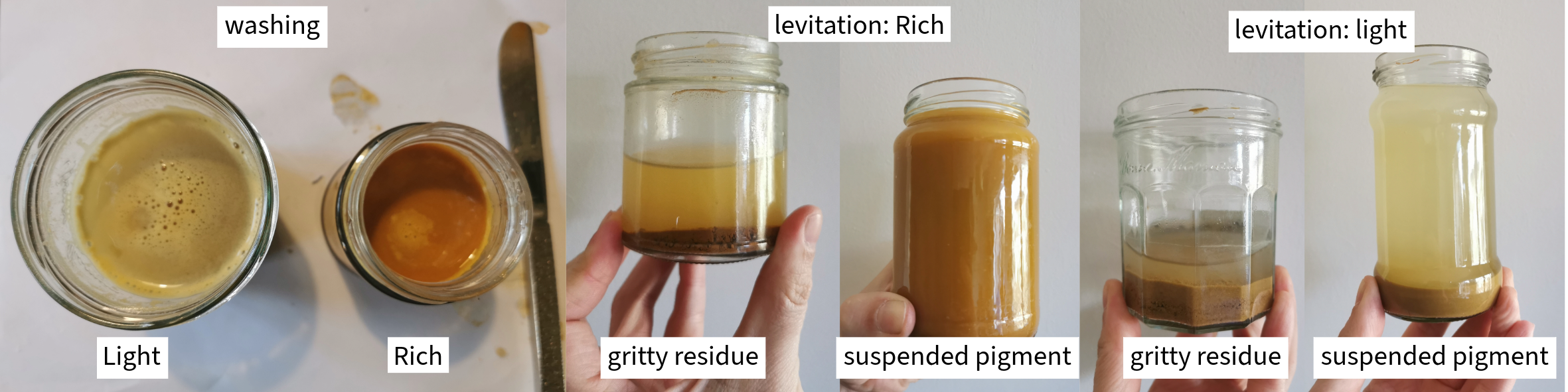
Processing mineral samples through washing and levigation
Image credit: Charlotte Pratt
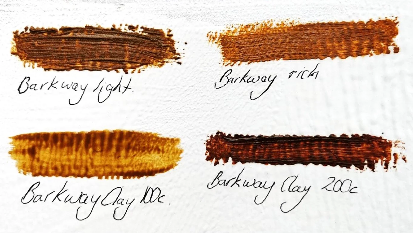
The levigation process removed a significant amount of sand from the samples, particularly the lighter ones. The fine pigment was left to settle in water, after which the excess water was removed and the pigments were dried. Once dry, they were ground further using a pestle and mortar or a ball mill, then sieved through a 325-mesh screen to create the final pigments. A 325-mesh screen corresponds to a nominal particle size of 44 microns (0.044 mm) which is, in my opinion, the largest size that still produces an acceptably smooth paint. After processing, I had four colours: two from the clay and two from the collected mineral samples. I mixed each with a small quantity of oil to test the final colours.
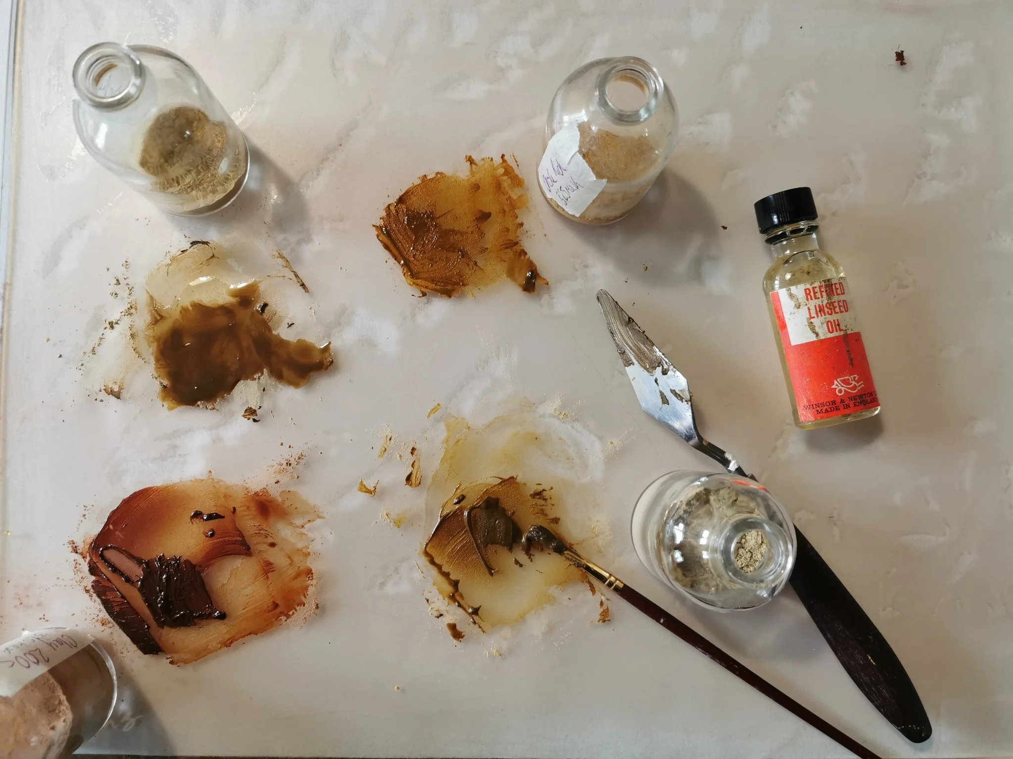
Mixing the final pigments with linseed oil to test colours. Top left: raw clay; top right: rich sample; bottom left: clay roasted to 200 °C; bottom right: light sample.
Image credit: Charlotte Pratt
The final colours, mixed with linseed oil and tested on a gesso board
Image credit: Charlotte Pratt
I was pleasantly surprised by the quality of the colours produced. Many mass-produced oil paints, except those at the top end of the market, contain significant bulking agents to make the paint go further. The colours produced by these foraged, pure pigments have a rich, deep quality and have captured something of the landscape. The raw clay is highly suggestive of fertile rich earth from which it was collected.
The raw clay produced a rich, warm yellow-brown with a hex code of #CE8D10. This colour is composed of 80.8% red, 42.7% green and 6.3% blue; in CMYK, it is composed of 0% cyan, 47.1% magenta, 92.2% yellow and 19.2% black. Paint colours with a similar composition are often described as golds, desert yellows or saffrons, making this the closest to a traditional yellow ochre pigment. The other pigments also yielded pleasing colours, although they tended more towards brown than yellow. The clay roasted to 200 °C produced a deeper, rich red-brown. The rich mineral sample produced a warm orange-brown, while the lighter mineral sample produced a similar shade with a greener cast.
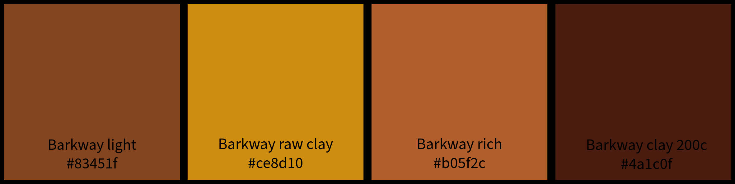
Colour samples created using a colour picker tool, with corresponding hex codes
Image credit: Charlotte Pratt
These four pigments are a successful first step on my quest for a colour. They evoke the hazelly brick earth from which they were formed whilst providing me with useful colours for portrait painting. The raw clay in particular is reasonably close to a commercial yellow ochre paint but with a depth provided by both the purity of the raw materials and the significance of their origins. Much like the colour synthesis chart produced by Lencos, in his study of the geography of colour, my library will eventually evoke the colour identity of the southeast of England.
Sources
Web
Royal Society of Chemistry. Prehistoric pigments. Available at:
https://edu.rsc.org/resources/prehistoric-pigments/1540.article
Lenclos, J.-P. The geography of colour. Available at:
https://www.jeanphilippelenclos.uk/en/geography
Artists & Illustrators. The Zorn palette: an essential guide. Available at:
https://www.artistsandillustrators.co.uk/how-to/art-theory/the-zorn-palette-an-essential-guide
St Albans City & District Council. Harpenden geology and landscape. Available at:
https://www.stalbans.gov.uk/sites/default/files/attachments/Harpenden
Encycolorpedia. Colour information for #CA8D16. Available at:
https://encycolorpedia.com/ca8d16
Books
Eastaugh, N., Walsh, V., Chaplin, T. and Siddall, R. (2004). Pigment Compendium: A Dictionary of Historical Pigments. London: Routledge.
Kremer Pigmente. Historical Ink Recipes. Aichstetten: Kremer Pigmente GmbH & Co. KG.
Matejak, J. (2022). Oil Painting: Contemporary Guide to Realistic Oil Painting, Underpaintings, Layered Techniques and Direct Painting Methods for Beginners. Jan Matěják.
Thompson, D. V. (1956). The Materials and Techniques of Medieval Painting. New York: Dover Publications.
Images
All photographs are by Charlotte Pratt. Kindly refrain from using them without permission and proper credit.