Anna Starmer: Colour Expert + Creator of Luminary Colour
There is a way that light falls across a street on an autumn day, across earth tones, copper leaves, chestnuts polished by rain. Hues that feel almost edible.
Anna is the founder of Luminary Colour, an independent colour forecasting consultancy practice based in Sussex, England, where she has spent more than two decades working internationally as a colour specialist across fashion, interiors, beauty, automotive and product design. Her practice is rooted not only in the visual but in the visceral and relational qualities of colour; an approach that asks us to consider what colour communicates. At the heart of her work is Luminary, her bi-annual, two-years-ahead colour forecast publication invested in by global brands, design agencies and retailers, from Ikea to Marks & Spencer, Volvo to Victoria’s Secret. Each Luminary book contains 60 colours and six individual colour stories, brought to life through Anna’s photographic storytelling, alongside contributions from colour and material specialists, artists and creatives pushing forward what colour means in today’s world. These limited-edition books are self-published and sold through specialist agents in ten countries. They function as working tools, designed to be taken apart; their swatches cut, arranged and used inside design studios to guide designers to brand directors to select and action beautiful colours.
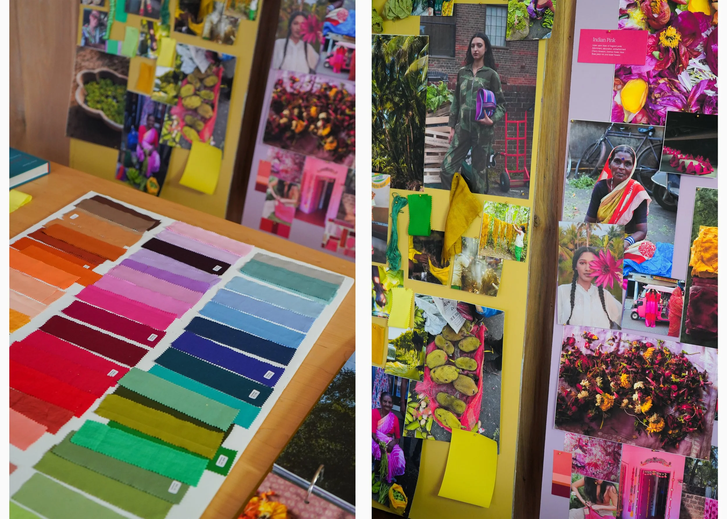
Behind Luminary lies a colour library of more than 1200 technically dyed swatches, produced under strict quality-controlled conditions in a UK dye house. Each colour exists as a dyed swatch, spectral data, printed paper reference, digital colour and an Adobe-ready value, forming a highly detailed system for specifying, matching and reproducing colour at a commercial scale. This technical system forms the backbone of Luminary’s work. These are created from waste food, flowers, forestry by-products and locally foraged plants, experimental colour research intended to inspire the design industry to rethink how colour is made and where it originates. These swatches act as both inspiration and provocation: a call for more responsible production across global design brands. Beyond publishing, Luminary Colour Consultancy supports product developers and design teams to define better colours; building palettes and producing the photography and visual storytelling that bring these shades to life, from carpets to kettles, lingerie to paint.
Anna also hosts Luminary Studio days in Lewes, East Sussex: playful, immersive sessions exploring where colour comes from and how we might approach it more thoughtfully for our collective future. These are often co-hosted with specialists working in areas such as botanical ink making, future materials and material innovation. Her practice as a photographer has shaped a distinct way of seeing and her images linger on soft, fleeting moments; found materials, quiet textures, subtle shifts of light, all contributing to an attuned way of working. She continues creating systems, stories and tools that support designers across the world in cultivating spaces, products and material futures.
We speak with Anna to find out more about her practice.
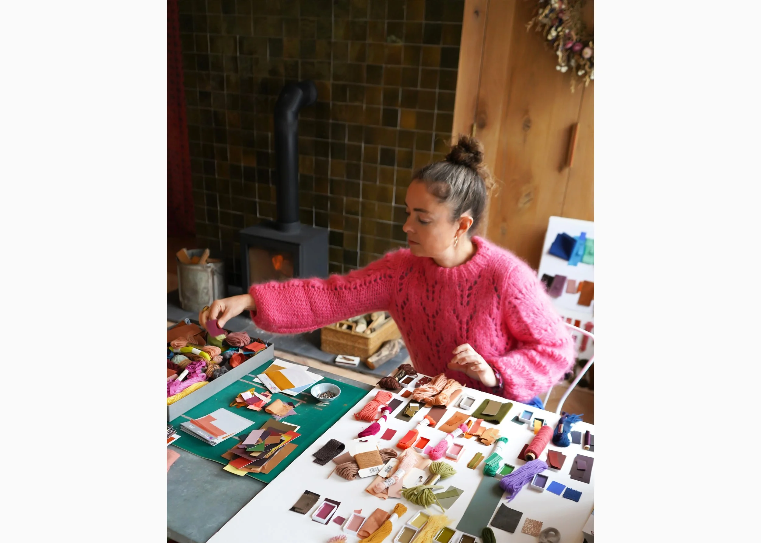
Anna Starmer at Luminary Studio
Photograph by Zeynep Sagir
When you begin shaping a new Luminary forecast, where does the first idea come from, a colour, a material, a shift in culture, or a question about where colour is heading?
Every colour comes from something different and unique, I am a treasure hunter, constantly collecting colours. It may be an image that inspires, a photograph that I take and bring back to the studio and use as the starting point for a new palette – or it might be a feeling that I have, or a specific mood that I feel is important, or a colour seen on a walk. I collect coloured threads, vintage fabrics, ceramic tiles, sweet wrappers, leaves, pebbles, coloured pencils – and have boxes of materials and objects in my studio. I use these materials to pull together a collection of colours, spending days at my desk playing with combinations, nuances and tones of colours – on different textures. My aim is to pull together a group of colours that evokes the feeling or story I have in my head and also colour combinations that look both beautiful and new in some form.
The next phase is that these objects are sent to my dyers who match the colour and dye a sample swatch. Whether we are creating a technical colour from chemical dyes or a botanical shade from waste food – every colour swatch is sent back to me at the studio and analysed together with the other shades in the book. I create 60 original colours for each publication and I always aim to have a balanced selection from neutrals and foundation colours, to brights, darks and mid-tone shades, this gives my clients a versatile selection of shades to work with.
Your colour library contains more than 1200 technically dyed swatches. What does building and maintaining such a system involve, and how do designers use it in practice?
These colours have been built over almost 20 years of creating the Luminary books. I have several systems in place and keep the last few issue palettes together – as clients from all over the world order extra swatches when they are creating their palettes or communicating colour to their network. Colour swatches need to be kept in a dark, cool place and cared for. In 2023 I renovated a studio space and was able to build a stock room for the colours.
The colours in each book are also published as paper printed swatches and in digital format and Adobe ready swatches – so designers can import the shades into their digital or CAD work room and start creating print, pattern, stripes or graphics and packaging. Some clients take the colours to the paint shop and select new colours for their retail shop walls, other dye yarn for woven textiles, or lace and embroidery threads for lingerie – each client takes the Luminary colours on their own journey.
What do you believe are the most urgent questions the design industry should be asking about colour today, particularly around manufacturing, material sourcing, and environmental impact?
The role of a trend and colour forecaster has changed dramatically over the last 30 years. Our decision making and ideation is layered with future global impact due to the way that goods are manufactured and consumed today. My hope is that by continuing to champion innovation in colour technologies and material developments – my clients will be encouraged to rethink some of their systems. My work sits between concept, future innovation and radical thinking – but also the realities of mass consumerism, the realities of living in an over-populated planet and the continued cost of living crisis. I am acutely aware that most people cannot afford to buy organic/sustainable/limited edition/small batch – good design comes at a high price point. In fact, 80% of a product's environmental impact is influenced by decisions made at the design stage – our work as designers has never been more important. But we have to encourage large brands to start funding ideation, innovation and startups – in order to discover the colour and material technologies that will move us beyond our reliance on fossil-fuel based resources and a low-paid global workforce.
Luminary Studio
Photograph by Zeynep Sagir
How do you approach developing a two-years-ahead colour forecast for global brands, and what does the research process behind a Luminary publication look like?
Possibly I answered this already… The short answer is that I have been doing this for a long time and I can see the patterns and evolution of colour families. My forecasts are a refelction of what I am seeing around me, what is inspiring me and which colours I feel like I need to see in the near future. I sit on several colour panels each year and we discuss art, culture, politics, fashion, and the general current mood. Often I have a feeling – that for instance we all need colours that are hopeful and optimistic, or calming interior shades that act like a cocoon….
How has your own relationship with colour evolved over time, and what continues to surprise you about your work?
I do have a certain taste level – I like rich and saturated colours – in my ‘20’s I was known for my pink hair and crazy vintage fabrics! I turned 50 last year and I feel like my taste levels are shifting – I never know if its me, or what I am seeing around me! I am working more recently with interior materials companies like carpets, paints, upholstery fabrics – and these colours need to be more timeless, beautiful shades that we intend to live with for years to come. I am enjoying colours that are rich but deeper, not brights – like a beautiful deep bronzed green or a very deep paprika red-wine. Colours are warmer, neutrals are moving away from cool greys toward porcini, biscuit, caramel and cocoa.
Your photographic storytelling is central to each Luminary book. How do you translate a colour into an image or still life that communicates its mood and materiality?
Sometimes an image leads the way – last year I had a sauna and wild swim in the lake in Zurich. I photographed the inky blue-black-teal rippling cold water afterwards and this inspired a selection of dark wintery colours for Issue 32. In the studio I like to create still life photography of the found objects and collected materials which have inspired certain colours. The purpose of this is to bring the flat colours to life – showcasing textures, surfaces and tonalities to inspire how to use the colours and which surfaces these colours would work best on. Perhaps a pale set of colours on matte chalky pebbles, or soft warm autumnal reds onto velvet, glazed ceramics and polished wood. I collect future materials and use them in my imagery, bio-colours, pigments derived from micro-algae or inks made from acorns.
Colour is a never ending source and each of us has a deeply personal and instinctive response to colour. Today we are overwhelmed with colour and information, my books aim to edit down the inspirations and extract the most beautiful things that I find around me – giving my clients a clear and authentic path forward for their individual future colour journey.

Luminary books
Photograph by Zeynep Sagir